Published:
December 4, 2002
By Richard G. Baldwin
DSP Programming, Notes # 104
Viewing tip
You may find it useful to open another copy of this lesson in a separate browser window. That will make it easier for you to scroll back and forth among the different figures while you are reading about them.
Supplementary material
I recommend that you also study the other lessons in my extensive collection of online programming tutorials. You will find a consolidated index of my online tutorial lessons at www.DickBaldwin.com.
I will explain the meaning of sampling, and will explain some of the problems that arise when sampling and processing analog signals. Those problems generally relate to the relationship between the sampling frequency and the high-frequency components contained in the analog signal.
I will explain the concept of the Nyquist folding frequency, which is half the sampling frequency.
I will illustrate the frequency folding phenomena by plotting sampled time series data as well as spectral data.
Sinusoids, time series, composition, and decomposition
I introduced you to sinusoids and sampled time series in an earlier lesson. I taught you about sine and cosine functions, and the Java methods used to calculate their values. I also introduced the concepts of period and frequency for sinusoids.
While introducing decomposition, I told you that almost everything we will discuss in this series on DSP is based on the premise that every time series can be decomposed into a large number of sinusoids, each having its own amplitude and frequency.
I also introduced the concept of composition, where any time series can be created by adding together the correct set of sinusoids, each having its own amplitude and frequency.
The notion of sampling analog signals
While signal processing can be accomplished in a variety of ways, including analog processors, digital processors, and optical processors, DSP is based on the notion that signals in nature can be sampled and converted into a series of numbers. The numbers can be fed into some sort of digital device, which can process the numbers to achieve some desired objective.
What is meant by sampling?
To sample a signal means to measure and record its amplitude at a series of points in time. For example, you might record the temperature in your office every ten minutes for twenty-four hours. In this case, the actual temperature in your office would be the analog signal. The 144 temperature values that you record would be a sampled time series intended to represent that analog signal.
Uniform sampling is most common
Although uniform sampling is not strictly necessary, the most common practice is to sample the signal at uniform intervals of time, (such as once every ten minutes, once per second, or one-thousand times per second). This results in a uniform sampling frequency.
(Most of the discussions in this series of tutorials on DSP will assume a uniform sampling frequency.)
Some problems arise
While sampled data can be used to simulate most of the signal-processing capabilities available with analog devices, the process of sampling does introduce some complications that must be dealt with. For the most part, these complications have to do with the relationship between the sampling frequency (in samples per second) and the highest frequency component contained in the signal (in cycles per second).
Stated simply, if the analog signal contains any sinusoidal components whose frequency is greater than half the sampling frequency, then those components will appear in the sampled time series at a different frequency. This can result in a variety of problems.
Reconstruction of the analog signal
Theoretically, if the sampling frequency is twice the highest frequency component contained in the analog signal, then the samples can be used in conjunction with an analog filter to reconstruct the original analog signal.
(However, this requires the construction of a perfect analog filter. In practice, the sampling frequency needs to be perhaps ten times the highest frequency component in the analog signal to make it practical to do a good job of reconstructing the analog signal from the samples.)
Reconstruction is not always required
Once the signal has been sampled and converted to digital form, there is often no interest in reconstructing the analog signal from the samples. While this eliminates the difficulty of reconstruction, it doesn't eliminate the potential problems caused by having the sampling frequency be less than twice the highest frequency component in the signal.
The Nyquist folding frequency
If the analog signal contains frequency components that are greater than half the sampling frequency, those components will appear to be at a different frequency in the sampled data.
The frequency that is equal to half the sampling frequency is often referred to as the Nyquist folding frequency, or simply the folding frequency. The folding frequency is half the sampling frequency. I will provide examples later to illustrate where this frequency gets its name.
A brief description
If a frequency component in the analog signal is less than the sampling frequency, but exceeds the folding frequency by an amount d, it will appear in the sampled data at a frequency that is the folding frequency minus d.
In other words, the entire frequency spectrum appears to fold around the folding frequency such that all frequency components that are above the folding frequency fold down to a similar position on the lower side of the folding frequency. Those frequency components above the folding frequency produce a mirror image below the folding frequency.
(If a frequency component in the analog signal is greater than the sampling frequency, folding still occurs, but in a more complicated way.)
Some specific numbers
Some specific numbers may make this easier to understand. Assume that the sampling frequency is 2000 samples per second, giving a folding frequency of 1000 cycles per second.
If an analog signal contains a frequency component at 1100 cycles per second, it will fold down and appear at 900 cycles per second in the sampled signal.
A frequency component at 1600 cycles per second in the analog signal will fold down and appear at 400 cycles per second in the sampled signal.
A frequency component at 2000 cycles per second (the sampling frequency) will fold down and appear at zero frequency in the sampled signal.
A few comments about sampling
The folding behavior is fairly easy to illustrate graphically, and I will do that shortly. Before doing that, however, I need to make a few comments about what it really means to sample an analog signal.
What do we really have?
First we need to think about what we really have when we have a sampled time series. All that we really have is a set of values taken at specific times. In reality, we know nothing about the values that actually existed for the analog signal in-between the samples.
For example, in the temperature experiment described earlier, when we record the temperature once every ten minutes, we can't really say what values we would have recorded if we had recorded the temperature once every five minutes instead. Therefore, we sometimes find ourselves estimating what the values are between the recorded samples.
Sampled sinusoids
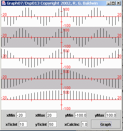
Consider the five plots shown in Figure 1.

Figure 1 Samples from five different sinusoids
Figure 1 shows the values for samples taken from five different sinusoids (the height of each vertical bar represents the value of a sample).
All five sinusoids were sampled at the same sampling frequency. The sinusoid in the center was sampled twenty times per cycle (not necessarily twenty times per second).
The two sinusoids above the center had higher frequencies than the sinusoid in the center, with the sinusoid at the top having the highest frequency. For a fixed sampling frequency, the sinusoids above the center had fewer samples per cycle than the sinusoid in the center. The sinusoid at the top had the fewest number of samples per cycle.
The two sinusoids below the center had lower frequencies, than the sinusoid in the center, with the sinusoid at the bottom having the lowest frequency. The two sinusoids below the center had more samples per cycle than the sinusoid in the center. The sinusoid at the bottom had the most samples per cycle.
The number of samples per cycle is important
In the final analysis, what really counts is not the number of samples per second of the sampling frequency, or the number of cycles per second of the signal frequency. What really counts is the number of samples per cycle of the highest frequency component. This value is established by the combination of the signal frequency and the sampling frequency.
The values between the samples
Because the plots in Figure 1 are pure sinusoids, I can mathematically determine the values between the samples. However, if there had been the slightest amount of random noise superimposed on the sinusoids, (which is the more realistic situation), I would have no way of knowing the values between the samples. Thus, all of the information that I have about these five signals is contained in the heights of the vertical bars shown in Figure 1.
Estimating the values in between the samples
As mentioned earlier, we often find ourselves estimating the values in between the samples. One way to do this is shown in Figure 2, which shows a different graphical treatment for the same five sinusoids.
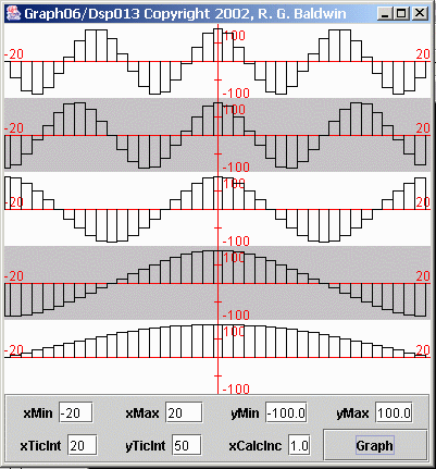
Figure 2 Rectangular representations of samples from five sinusoids
Figure 2 represents each of the sample values as a rectangle. In effect, this treatment estimates that there is no change in the value of the analog signal for half a sample interval after the sample is taken. Then the value of the analog signal jumps to the value of the next sample.
A more common representation
Now consider the graphical treatment for the same five sinusoids shown in Figure 3.
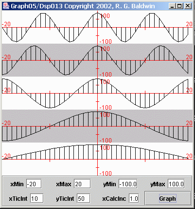
Figure 3 Trapezoidal representations of samples from five sinusoids
Figure 3 shows a more common representation of the data. Figure 3 treats each sample as a trapezoid consisting of a rectangle and a right triangle. The triangle sets atop the rectangle and connects each sample value to the next with a straight line.
The most common representation
Now consider the most common representation of the sampled data, as shown in Figure 4.

Figure 4 Most common representations of samples from five sinusoids
Figure 4 shows the most common representation of the sampled data. Figure 4 is the same as Figure 3 except that the vertical lines that identify the sides of the trapezoids have been omitted. In Figure 4, each sample value is connected to the next sample value with a straight-line segment.
What happens when the sampling frequency is reduced?
As you can see in these figures, regardless of which graphical treatment you use, the sampling frequency relative to the signal frequency is sufficiently high to present a respectable view of the sinusoidal signals. Now I'm going to show you what happens when the sampling frequency is reduced without changing the frequency of the sinusoids.
Figure 5 shows the same five sinusoids as above, except that they are plotted across a longer period of time. (The presentation in Figure 5 treats each sample as a rectangle.)
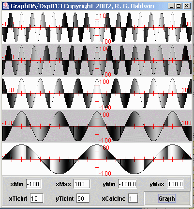
Figure 5 Five sampled sinusoids
In particular, you should note the obvious frequency difference between the top sinusoid and the bottom sinusoid. Also note the frequency difference between the two sinusoids immediately above and immediately below the center sinusoid.
Some numbers
Let's put some numbers to the frequencies involved. If we consider the sampling frequency to be 20 samples per second, then the center sinusoid has a frequency of one cycle per second, with 20 samples per cycle. On that basis, the frequencies of the sinusoids from top to bottom are as shown below:
1.75 cycles per second
1.50 cycles per second
1.00 cycles per second
0.50 cycles per second
0.25 cycles per second
Comparison of frequencies with center frequency
The most important thing to note about these frequency values is how the four outer frequencies relate to the center frequency. The top and bottom frequency values differ from the center frequency by 0.75 cycles per second. In other words, the frequency of the top sinusoid is 0.75 cycles per second above the frequency of the center sinusoid, and the frequency of the bottom sinusoid is 0.75 cycles per second below the frequency of the center sinusoid.
Similarly, the second and fourth frequency values differ from the center frequency by 0.50 cycles per second. Again, one is above and the other is below.
Reduce the sampling frequency
What I am going to do now is to recalculate and re-plot the values for each sinusoid at a sampling frequency of two samples per second instead of 20 samples per second. This will place the frequency of the center sinusoid exactly at the folding frequency of one cycle per second. More importantly, this will place the frequencies of the top two sinusoids above the folding frequency.
Re-plot the sampled data
I will re-plot the data for each sinusoid across the same period of time as in Figure 5. The results are shown in Figure 6. It would probably be useful for you to view Figures 5 and 6 side-by-side in separate browser windows.
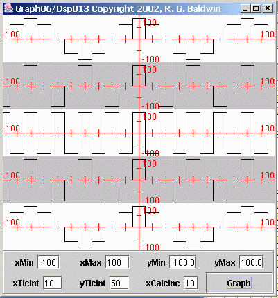
Figure 6 Result of re-sampling the five sinusoids
There are several important things to note about Figure 6.
Center plot no longer resembles a sinusoid
First, you will probably notice that the plot for the center sinusoid no longer looks much like a sinusoid. Rather, it looks like a square wave. This is the result of having exactly two samples per cycle of the sinusoid. One sample is taken from the positive lobe of the sinusoid, and the next sample is taken from the negative lobe of the sinusoid. This pattern repeats, producing something that looks like a square wave. (A different graphical treatment would make it look like a triangular wave.)
The top two sinusoids
More important, however, is to note what has happened to the top two sinusoids. Because the frequencies of the top two sinusoids are above the folding frequency, they no longer have a minimum of two samples per cycle. Thus, the apparent frequency of these two sinusoids has folded around the folding frequency and appears as a lower frequency.
Top sinusoids match bottom sinusoids
In fact, the plot of the top sinusoid now looks exactly like the plot of the bottom sinusoid at a frequency of 0.25 cycles per second. This means that the energy in the top sinusoid at 1.75 cycles per second has folded into a new frequency of 0.25 cycles per second.
The plot of the sinusoid immediately above the center looks exactly like the plot of the sinusoid immediately below the center at a frequency of 0.50 cycles per second. This means that the energy in that sinusoid at 1.5 cycles per second has folded into a new frequency of 0.5 cycles per second.
Bottom three plots are correct
The plots of the center sinusoid and the two sinusoids below the center are still correct (although not very well sampled). However, the frequency information embodied in the top two sinusoids has been lost. The top two sinusoids appear to be at a different frequency than the actual frequency of the corresponding analog signals. The fact that the frequencies of these two sinusoids were originally 1.75 and 1.50 cycles per second is now lost in the sampled data.
A different approach
Now I'm going to illustrate the same folding phenomena from a different perspective using spectral analyses. First I will show you a case having no sampling problems. Then I will introduce a sampling problem and show you the impact that the problem has on the final results.
Figure 7 shows the result of performing spectral analyses on five different sinusoids (not the same five as in the previous discussion). Each plot in Figure 7 shows the spectrum of a different sinusoid. The spectrum is computed and displayed from zero frequency on the left to the folding frequency on the right.
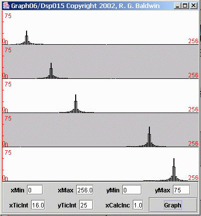
Figure 7 Spectral analyses of five sinusoids with no sampling problems
Sampling frequency was four samples per second
The sampling frequency for the data in Figure 7 was four samples per second, giving a folding frequency of two cycles per second. Thus, the horizontal scale on each plot represents the frequencies from zero on the left to two cycles per second on the right.
The five sinusoids
Starting at the top, each of the five plots represents the frequency spectrum of
a sinusoid
having the amplitude and frequency shown in the following table.
| Plot | Amplitude |
Frequency |
| 1 | 60 | 0.25 cycles per second |
| 2 | 70 | 0.50 cycles per second |
| 3 | 80 | 0.75 cycles per second |
| 4 | 90 | 1.50 cycles per second |
| 5 | 100 | 1.75 cycles per second |
The heights of the spectral peaks
The height of each spectral peak in Figure 7 is consistent with the amplitudes of the sinusoids given in the table.
The locations of the spectral peaks
The spectral peaks in Figure 7 appear where you would expect to see them. For example, the location of the peak in the first plot corresponds to a frequency of 0.25 cycles per second within a total frequency range extending from zero to two cycles per second. This matches the information given in the above table for the first sinusoid.
The location of the spectral peak in the fifth plot corresponds to a frequency of 1.75 cycles per second within a total frequency range extending from zero to two cycles per second. This matches the information given in the above table for the fifth sinusoid.
The location of the peak in each of the three plots between the first and the last are correct for the frequency of the sinusoid involved.
Introduce a sampling problem
Now I will introduce a sampling problem by keeping the frequencies of the sinusoids the same and reducing the sampling frequency from four samples per second to two samples per second.
The result of this change is shown in Figure 8.
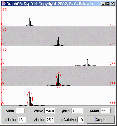
Figure 8 Spectral analyses of five sinusoids with sampling problem
As before, each of the plots in Figure 8 shows the frequency spectrum of an individual sinusoid. The spectrum is plotted from zero frequency on the left to the folding frequency on the right.
Sampling frequency was two samples per second
In this case, the sampling frequency was two samples per second, giving a folding frequency of one cycle per second. Therefore, the horizontal scale on each plot represents the frequencies from zero on the left to one cycle per second on the right.
The heights of the spectral peaks
Once again, the height of each spectral peak is consistent with the amplitude of the sinusoid.
The locations of the spectral peaks
As before, the spectral peaks in the first three plots appear where you would expect to see them. The peak in the first plot is about twenty-five percent of the way across the total spectrum, corresponding to 0.25 cycles per second.
The spectral peak in the second plot is at the center, corresponding to 0.5 cycles per second. The third peak is in the correct location for 0.75 cycles per second.
A problem with the location of two spectral peaks
However, a problem exists with the spectral peaks in the last two plots.
(I marked the two problem peaks with a red oval to make it obvious which ones I am talking about. You may find it helpful to compare Figure 8 side-by-side with Figure 7.)
The spectral peak in the fourth plot also appears about midway between zero and one cycle per second. This indicates that the corresponding sinusoid had a frequency of 0.5 cycles per second.
However, the frequency of the sinusoid for the fourth plot was 1.50 cycles per second, not 0.5 cycles per second as indicated. Thus, that spectral peak should have been off the scale on the right-hand side of the plot.
The folding frequency
Recall, however, that the right edge of the plot is the folding frequency. Therefore, any spectral components that should appear to the right of the folding frequency fold around and appear to the left of the folding frequency. Therefore, the spectral peak in the fourth plot, which should appear at 0.50 cycles per second above the folding frequency, appears instead at 0.50 cycles per second below the folding frequency.
The peak in the fifth plot
Similarly, the frequency of the sinusoid for the fifth plot was 1.75 cycles per second. The peak for this sinusoid should have appeared 0.75 cycles per second above the folding frequency, but appeared instead 0.75 cycles per second below the folding frequency. In other words, the spectrum folded around the folding frequency so that this peak appeared below the folding frequency.
I am going to show you two more views of the spectra of these sinusoids to help you better understand the folding phenomena.
Back to the case with no problems
Let's go back and examine another view of the case that has no sampling problems. This view is shown in Figure 9.
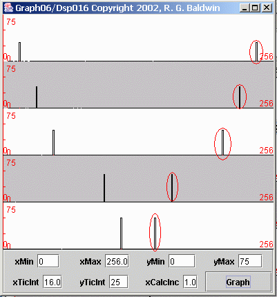
Figure 9 Spectral analyses of five sinusoids with no sampling problems
Sampled at four samples per second
This is the case where all five sinusoids are sampled at a sampling frequency of four samples per second, resulting in a folding frequency of two cycles per second. If you compare Figure 9 with Figure 7, you will see that the left half of Figure 9 is very similar to Figure 7.
Figure 9 shows twice the frequency range
In Figure 7, the spectral data was computed and displayed from zero frequency on the left to the folding frequency (two cycles per second) on the right. In Figure 9, the spectral data was computed and displayed from zero frequency on the left to the sampling frequency (four cycles per second) on the right.
Thus, the total frequency range for Figure 9 is twice the frequency range for Figure 7.
Folding frequency at the center
In Figure 9, the folding frequency is exactly in the center of each plot. In other words, the center of the plots in Figure 9 corresponds to the right edge of the plots in Figure 7. Everything to the left of center in Figure 9 corresponds to the plots in Figure 7. The material to the right of center in Figure 9 was not shown in Figure 7.
Why is it called the folding frequency?
Hopefully the display in Figure 9 will explain why the frequency that is half the sampling frequency is called the folding frequency. The computed spectrum folds around that frequency. Everything to the right of the folding frequency is a mirror image of everything to the left of the folding frequency.
Peaks below folding frequency are valid
All the peaks to the left of center in Figure 9 are valid spectral peaks associated with the corresponding sinusoids. However, all the peaks to the right of center, which I marked with red ovals, are artifacts of the sampling process. Those peaks do not exist in the true spectrum of the original raw data. They were created by the sampling process.
Normally don't compute the mirror image
Normally we don't worry about this mirror image above the folding frequency when doing spectral analyses. We know it is there and we simply ignore it.
In fact, for reasons of economy, when doing spectral analyses using discrete
Fourier transforms, we usually don't even compute the spectrum at frequencies
above the folding frequency. Since it is always a mirror image of the
spectrum below the folding frequency, we know what it looks like without even
computing it.
|
What happened to the peak structure In case you are wondering why the peaks in Figure 9 have less structure than the peaks in Figure 7, this is because the points at which I computed the spectral data in Figure 9 were twice as far apart as the points at which I computed the spectral data in Figure 7.
Although it's not obvious at this plotting scale, there are zero-valued points between the side lobes on the peaks in Figure 7. The points in the spectra of Figure 9 simply missed the side lobes and hit the zeros between the side lobes. I will have a lot more to say about this in a future lesson discussing spectral analysis. |
Now for the sampling problem
Now let's take another look at the case with the sampling problem. This is the case where the sampling frequency was reduced from four samples per second to two samples per second but the frequencies of the sinusoids was not changed. This view of the problem is shown in Figure 10. It will probably be useful for you to compare Figure 10 with Figure 8.
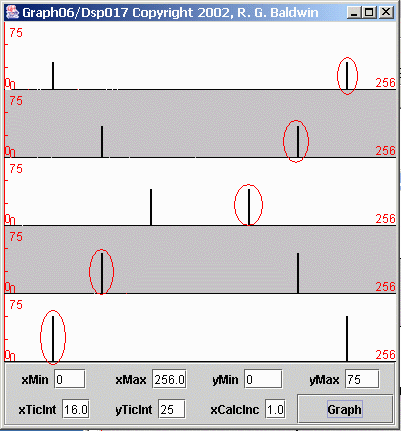
Figure 10 Spectral analyses of five sinusoids with sampling problem
Folding frequency is at the center
As with the previous case, each of the plotted spectra in Figure 10 shows the frequency range from zero frequency to the sampling frequency of two samples per second. The folding frequency of one cycle per second appears in the center of each plot.
Peaks to left correspond to Figure 8
The peaks to the left of center in Figure 10 correspond to the peaks in Figure 8. Because the right edge of Figure 8 is the folding frequency, the peaks to the right of center in Figure 10 don't appear in Figure 8.
A mirror image
As is always the case, everything to the right of the folding frequency in Figure 10 is a mirror image of everything to the left of the folding frequency.
I have identified the artifacts created by the sampling process with a red oval in Figure 10.
Raw data frequency exceeds folding frequency
The problem, as you will recall, is that the frequency of the sinusoids corresponding to the two bottom plots in Figure 10 is above the folding frequency. Thus the peaks to the right of center in the bottom two plots of Figure 10 actually represent the frequencies of the corresponding sinusoids.
Unfortunately, these two peaks appear to the right of the folding frequency, which the area of the spectra that we normally ignore.
Artifacts to the left of the folding frequency
Furthermore, these two peaks are reflected through the folded mirror image process into the area to the left of the folding frequency. For these two sinusoids, the peaks to the left of the folding frequency are artifacts, and I have identified them as such with ovals.
Normally can't identify artifacts
I am able to identify these two peaks as artifacts only because I know the true frequency makeup of the raw data. In most real-world situations with unknown data, there would be no way for me to identify these particular peaks to the left of the folding frequency as artifacts.
Illustrates the folding frequency
Hopefully this illustration will make the concept of the folding frequency easier for you to understand. The folding frequency is one-half the sampling frequency. The entire spectrum below the folding frequency folds around the folding frequency and the peaks in that spectrum appear in mirror-image format above the folding frequency.
The frequency information for all frequency components above the folding frequency is lost when the signal is sampled. In addition, the energy associated with those components will fold around and can corrupt the information for frequency components that are below the folding frequency.
The bottom line
The bottom line is that you must be very careful when sampling analog signals for later processing using DSP. In order to avoid erroneous results, you must sample sufficiently fast to ensure that your sampling rate is greater than twice the highest frequency components contained in the analog signal.
On the other hand, the greater your sampling rate, the more computer-intensive will be most of the DSP techniques that you apply to the data later. For economy reasons, therefore, you don't want your sampling frequency to be excessively high.
Using an analog low-pass filter
A common approach to sampling is to feed the analog signal into an analog-to-digital (AtoD) converter. This is a device that measures the amplitude of the analog signal at a uniform sampling frequency. It is common practice to place a low-pass analog filter immediately ahead of the converter to suppress any analog frequency components that are greater than one-half the sampling frequency.
Digital re-sampling
Another common approach is to initially sample the analog signal at a sufficiently high rate to ensure that the sampling rate is greater than twice the highest frequency contained in the analog signal. Then, if you really don't need all of that high-frequency information, you can apply a low-pass digital filter to suppress the high-frequency energy. Then you can re-sample the data to a lower sampling frequency simply by discarding samples. The data with the lower sampling frequency can then be used for further DSP analysis.
The problems generally relate to the relationship between the sampling frequency and the high-frequency components contained in the analog signal.
I explained the concept of the Nyquist folding frequency, which is half the sampling frequency.
I illustrated the frequency folding phenomena by plotting sampled time series data as well as spectral data.
Copyright 2002, Richard G. Baldwin. Reproduction in whole or in part in any form or medium without express written permission from Richard Baldwin is prohibited.
Richard has participated in numerous consulting projects and he frequently provides onsite training at the high-tech companies located in and around Austin, Texas. He is the author of Baldwin's Programming Tutorials, which has gained a worldwide following among experienced and aspiring programmers. He has also published articles in JavaPro magazine.
In addition to his programming expertise, Richard has many years of practical experience in Digital Signal Processing (DSP). His first job after he earned his Bachelor's degree was doing DSP in the Seismic Research Department of Texas Instruments. (TI is still a world leader in DSP.) In the following years, he applied his programming and DSP expertise to other interesting areas including sonar and underwater acoustics.
Richard holds an MSEE degree from Southern Methodist University and has many years of experience in the application of computer technology to real-world problems.
-end-