Published:
December 11, 2002
By Richard G. Baldwin
DSP Programming, Notes # 108
Viewing tip
You may find it useful to open another copy of this lesson in a separate browser window. That will make it easier for you to scroll back and forth among the different figures while you are reading about them.
Supplementary material
I recommend that you also study the other lessons in my extensive collection of online programming tutorials. You will find a consolidated index of my online tutorial lessons at www.DickBaldwin.com.
Some of what you have previously learned
In a previous lesson, I explained the meaning of sampling, and discussed some of the problems that occur as a result of high-frequency components in the analog signal.
Measure and record the signal amplitude
I told you that to sample an analog signal means to measure and record its amplitude at a series of points in time. The values that you record constitute a sampled time series intended to represent the analog signal.
Avoiding frequency folding
I told you that to avoid problems, the sampling frequency must be a least twice as great as the highest frequency component contained in the analog signal, and as a practical matter, should probably be somewhat higher.
Sinusoids, frequency, and period
I introduced you to sinusoids, taught you about sine and cosine functions, and introduced the concepts of period and frequency for sinusoids.
Decomposition of time series
I told you that almost everything we will discuss in this series on DSP is based on the premise that every time series can be decomposed into a large number of sinusoids, each having its own amplitude and frequency.
The notion of DSP
I told you that DSP is based on the notion that signals in nature can be sampled and converted into a series of numbers. The numbers can be fed into some sort of digital device, which can process the numbers to achieve some desired objective.
This is a broad-ranging lesson. It begins with a discussion of averaging time series, ends with a discussion of spectral resolution, and covers several related topics in between. Don't be alarmed, however, at the range of the lesson. The topics of time-series averaging and spectral resolution are very strongly related.
I will discuss why we frequently need to average sampled time series, and explain some of the issues involved in that process.
I will also show you the impact of those averaging issues on DSP, using spectrum analysis as an example.
It never ceases to amaze me how something as mathematically complex as DSP can be distilled down to the simplest of computational processes.
Which screw to turn ...
DSP reminds me of the old story about the customer who complained about the bill at the auto repair shop being too high. According to the customer, all the mechanic did to fix the problem was turn one screw, and the bill was too high for the labor involved. The mechanic responded that he didn't charge for turning the screw. Rather, he charged for knowing which screw to turn, and knowing which way to turn it.
Turning the screws in DSP
Knowing how to turn the screw is not the complicated part of DSP. Rather, the complicated part of DSP lies in knowing which screw to turn and which way to turn it. Once you know that, you will be surprised just how easy it is to actually turn the screw.
Computing the average value of a time series
As you will learn in this series of lessons, a large majority of DSP operations consist simply of the following two steps:
In many cases, it is the average value of the third time series that provides the answer you are seeking.
The challenge is in knowing what the average value means, and how to interpret it.
Decomposition of time series
Almost everything that we will discuss in this series on DSP is based on the premise that every time series can be decomposed into a (potentially large) number of sinusoids, each having its own amplitude and frequency.
Suppose, for example, that we have two time series, each of which is composed of two sinusoidal components as follows:
f(x) = cos(ax) + cos (bx)
g(x) = cos(cx) + cos(dx)
The product of the two time series is given by:
h(x) = f(x)*g(x)
= (cos(ax) + cos (bx))
* (cos(cx) + cos(dx))
where the asterisk (*) means multiplication.
Multiplying this out produces the following:
h(x) = cos(ax)*cos(cx)
+ cos(ax)*cos(dx)
+
cos(bx)*cos(cx)
+ cos(bx)*cos(dx)
A sum of products of sinusoids
Thus, the time series produced by multiplying any two time series consists of the sum of a (potentially large) number of terms, each of which is the product of two sinusoids.
The product of two sinusoids
We probably need to learn a little about the product of two sinusoids. I will discuss this topic with a little more mathematical rigor in a future lesson. In this lesson, however, I will simply illustrate the topic using graphs.
Important: The product of two sinusoids is always a new time series, which is the sum of two new sinusoids.
The frequencies of the new sinusoids
The frequencies of the new sinusoids are different from the frequencies of the original sinusoids. Furthermore, the frequency of one of the new sinusoids may be zero.
|
What is a sinusoid with zero frequency? As a practical matter, a sinusoid with zero frequency is simply a constant value. It plots as a horizontal straight line. Think of it this way. As the frequency of the sinusoid approaches zero, the period, (which is the reciprocal of frequency), approaches infinity. Thus, the width of the first lobe of the sinusoid widens, causing every value in that lobe to be the same as the first value. This will become a very important concept as we pursue DSP operations. |
Sum and difference frequencies
More specifically, when you multiply two sinusoids, the frequency of one of the sinusoids in the new time series is the sum of the frequencies of the two sinusoids that were multiplied. The frequency of the other sinusoid in the new time series is the difference between the frequencies of the two sinusoids that were multiplied.
An important special case
For the special case where the two original sinusoids have the same frequency, the difference frequency is zero and one of the sinusoids in the new time series has a frequency of zero. It is this special case that makes digital filtering and digital spectrum analysis possible.
Many sinusoidal products
When we multiply two time series and compute the average of the resulting time series, we are in effect computing the average of the products of all the individual sinusoidal components contained in the two time series. That is, the new time series contains the products of (potentially many) individual sinusoids contained in the two original time series. In the end, it all comes down to computing the average value of products of sinusoids.
Product of sinusoids with same frequency
The product of any pair of sinusoids that have the same frequency will produce a time series containing the sum of two sinusoids. One of the sinusoids will have a frequency of zero (hence it will have a constant value). The other sinusoid will have a frequency that is double the frequency of the original sinusoids.
The ideal average value
Ideally, the average value of the new time series will be equal to the constant value of the sinusoid with zero frequency. This is because, ideally, the average value of the other sinusoid will be zero.
Product of sinusoids with different frequencies
The product of any pair of sinusoids that do not have the same frequency will produce a new time series containing the sum of two sinusoids. One of the new sinusoids will have a frequency that is the sum of the frequencies of the two original sinusoids. The other sinusoid will have a frequency that is the difference between the frequencies of the two original sinusoids.
Ideal average value is zero
Ideally, the average value of the new time series in this case will be equal to zero, because ideally the average value of each of the sinusoids that make up the time series will be zero.
Oops!
As we will see later, we don't always achieve the ideal.
Examples of products of sinusoids
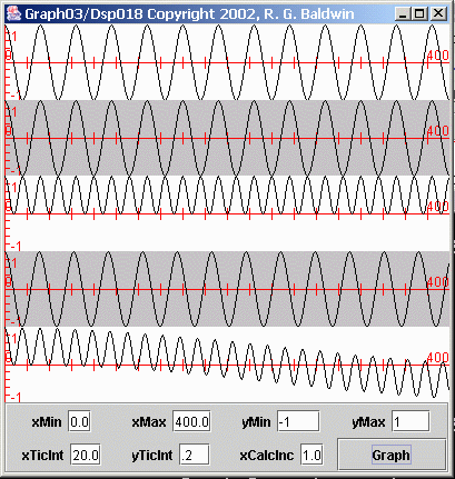
Let's examine some time series produced by multiplying sinusoids. Figures 1, 2, and 3 show the results of multiplying sinusoids having the same and different frequencies. Consider first the plots in Figure 1.
Figure 1 Products of sinusoids
Multiplying sinusoids with same frequency
The top plot in Figure 1 shows a sinusoid whose frequency and sampling rate are such that it has 32 samples per cycle. The second plot from the top in Figure 1 is identical to the top plot. (To simplify the explanation, these two sinusoids are also cosine functions.)
The third plot down from the top in Figure 1 shows the product of these two sinusoids, which have the same frequency. If you examine the third plot, you will notice several important characteristics.
A double-frequency sinusoid
By matching the peaks, you can determine that the frequency of the sinusoid in the third plot is double the frequency of each of the top two plots. (This is the sum of the frequencies of the two sinusoids that were multiplied together.)
Half the amplitude with a positive bias
Next, you will notice that the amplitude of the sinusoid in the third plot is half that of each of the first two plots. In addition, the entire sinusoid in the third plot is in the positive value range.
The sum of two sinusoids
The third plot is actually the sum of two sinusoids. One of the sinusoids has a frequency of zero, giving a constant value of 0.5. This constant value of 0.5 is added to all the values in the other sinusoid, causing it to be plotted in the positive value region.
Later on, we will compute the average value of the time series in the third plot, and ideally, that average value will be the constant value produced by the zero-frequency sinusoid.
Product of sinusoids with different frequencies
Now consider the bottom two plots in Figure 1. The fourth plot down from the top is a cosine function whose frequency is almost, but not quite the same as the frequency of the sinusoid in the top plot. The sinusoid in the top plot has 32 samples per cycle while the sinusoid in the fourth plot has 31 samples per cycle.
The time series in the bottom plot is the product of the time series in the first and fourth plots.
The sum of two sinusoids
Once again, this time series is the sum of two sinusoids, one whose frequency is the difference between the two original frequencies, and one whose frequency is the sum of the two original frequencies.
However, in this case, the difference frequency is not zero. Rather, it is a very low frequency. What you see in the bottom plot of Figure 1 is a sinusoid whose frequency is the sum of the two original frequencies added to a sinusoid whose frequency is the difference between the two original frequencies. Because the two original frequencies were almost equal, the frequency of the second sinusoid is very low.
As you can see, the low-frequency component in the bottom plot in Figure 1 appears to be the beginning of a cosine function whose period is much greater than the width of the plot (400 points).
Another view of the same data
Figure 2 shows another view of the bottom two plots from Figure 1.
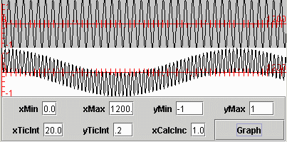
Figure 2 Products of sinusoids
The difference between Figure 2 and Figure 1 is that while Figure 1 shows only 400 points along the x-axis, Figure 2 shows 1200 points along the x-axis. Thus, the horizontal scale in Figure 2 is significantly compressed relative to the horizontal scale in Figure 1.
More than one cycle
Figure 2 lets you see a little more than one full cycle of the low-frequency component of the time series produced by multiplying the two sinusoids.
(Figure 2 does not provide a very good representation of the high-frequency component. This is because I plotted 1200 points in a part of the screen that is only 400 pixels wide. On my computer, I can expand this to the full screen width. However, I can't publish it at that width, so I published the 400-pixel version.)
Averaging can be problematic in this case
Later on, we will compute the average value of the time series represented by the bottom plot in Figures 1 and 2. Ideally, that average value will be zero. However, you have probably already figured out that a great many data points must be included in the computation of the average to get anything near zero. An eyeball estimate indicates that about 900 data points are required just to include a single cycle of the low-frequency component.
More examples of the products of sinusoids
Figure 3 shows two additional time series created by multiplying sinusoids.
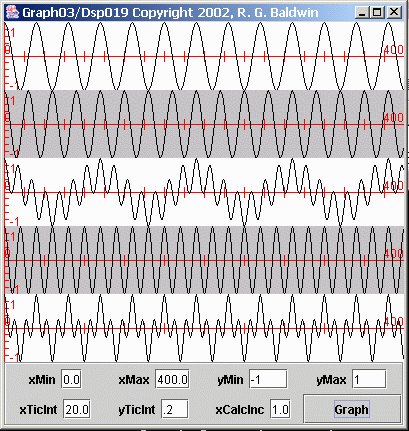
Figure 3 Products of sinusoids
The arrangement in Figure 3 is the same as in Figure 1. The top plot in Figure 3 is the same sinusoid shown in the top plot of Figure 1. This is a sinusoid with 32 samples per cycle.
Immediately below the top sinusoid in Figure 3 is another sinusoid. This sinusoid has 24 cycles per cycle. As you can see, the frequency of this sinusoid is a little higher than the frequency of the sinusoid in the top plot.
The time series in the third plot down from the top is the product of the time series in the top two plots. Again, this time series is composed of two new sinusoids whose frequencies are the sum of and difference between the two original frequencies.
A greater frequency difference
Because the frequency difference between the first two plots in Figure 3 is considerably greater than was the case for the bottom plot of Figure 1, the frequency of the low frequency component of the third plot in Figure 3 is considerably greater than was the case in Figure 1.
Later on, we will compute the average value of the third plot in Figure 3. Ideally, the average value will be zero.
An even greater frequency difference
The fourth plot in Figure 3 shows a sinusoid having 16 samples per cycle. The frequency of this sinusoid is double the frequency of the sinusoid in the top plot.
The bottom curve in Figure 3 shows the product of the first and fourth plots. As usual, this time series consists of the sum of two sinusoids whose frequencies are the sum and the difference of the original frequencies.
We will compute the average value of the bottom plot later on. Ideally, the average value will be zero.
What is the average value of a sinusoid?
Hopefully by now you understand why we need to be concerned about the average value of a sinusoid.
Consider Figure 4, which shows five different sampled sinusoids with different frequencies.
Figure 4 Five Sampled Sinusoids
We may be tempted to say that the average value of a sinusoid is zero. After all, the positive lobes of the sinusoid are shaped exactly like the negative lobes. Therefore, every positive value is offset by a corresponding negative value.
Is that a true statement?
Every positive value is offset by a corresponding negative value only if you compute the average over an even number of cycles of the sinusoid. For example, it is pretty obvious that if you compute the average on the 64 data values shown for the bottom plot in Figure 4, the result will not be zero. Rather, it will be a positive non-zero value.
Sample average values
Next we will take a look at the computed average values of the time series from Figures 1 and 3 that were produced by multiplying sinusoids.
The black curve in Figure 5 shows an expanded view of the sinusoidal curve from the top half of the third plot in Figure 1 (recall that the bottom half of that plot was empty, so I didn't include it in Figure 5). This curve was the result of multiplying two sinusoids with the same frequency.
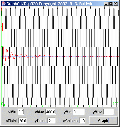
Figure 5 Computed average value of a time series
The average value
The red curve in Figure 5 shows the computed average value as a function of the number of points included in the average. In other words, a particular point on the red curve in figure 5 represents the average value of all the points on the black curve to the left of and including that point on the black curve.
The blue horizontal line if Figure 5 shows the ideal average value for this situation.
Result converges on the ideal
As more and more points are included in the average, the values of the positive and negative peaks on the red curve approach the ideal blue line asymptotically (except for a slight positive bias, which is the result of the sampling process).
An expanded view
Figure 6 shows a greatly expanded view of the red average values in Figure 5.
Figure 6 Expanded average value of a time series
The ideal value for this average is 0.5, and that is the value represented by the blue line. The plot in Figure 6 shows the same horizontal scale as Figure 5. However, the entire vertical plotting area in Figure 6 represents the values from 0.48 to 0.52.
Ideal value is never reached
As you can see, the ideal value is never reached in Figure 6 except at isolated points where the red curve crosses the horizontal line. Even if I extended the horizontal axis to 1200 or more points, that would continue to be the case.
A more serious case
Figure 7 computes and displays the average value of the bottom plot in Figure 2 (recall that this plot shows 1200 points on the horizontal axis, whereas Figure 5 shows only 400 points on the horizontal axis). Recall also that this time series was produced by multiplying two sinusoids having nearly the same frequency.
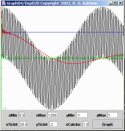
Figure 7 Computed average value of a time series
Red curve is the average
As before, the black curve in Figure 7 shows the time series, and the red curve shows the computed average value as a function of the number of points included in the average.
(In this case, I didn't even bother to show the short axis containing only 400 points. The horizontal axis in Figure 7 contains 1200 points, the same as in Figure 2.)
The ideal average value is zero
In this case, the ideal average value is zero, as indicated by the green horizontal axis. As you can see, even for a 1200-point averaging window, the average value deviates significantly from the ideal. We will see the detrimental impact of this problem later when I perform spectral analysis in an attempt to separate two closely-spaced peaks in the frequency spectrum.
Some additional examples of average values
Figure 8 computes and displays the average value of the third plot down from the top in Figure 3. This plot was produced by multiplying the two sinusoids in the top two plots in Figure 3.
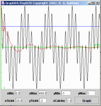
Figure 8 Computed average value of a time series
As before, the black curve in Figure 8 represents the time series, and the red curve represents the average value of the time series as a function of the number of points included in the average.
For this case also, the ideal average value is zero, as represented by the green horizontal axis. The positive and negative peaks in the red average value can be seen to approach the ideal value asymptotically within the 400 horizontal points plotted in Figure 8.
Figure 9 computes and displays the average value of the bottom plot in Figure 3. This time series was produced by multiplying the top plot in Figure 3 by the fourth plot in Figure 3.
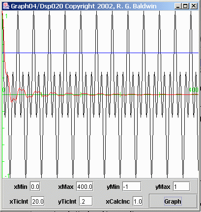
Figure 9 Computed average value of a time series
Once again, the black curve in Figure 9 represents the time series, and the red curve represents the average value of the time series as a function of the number of points included in the average. In this case, the average converges on zero rather nicely within the 400 points included on the horizontal axis.
A short recap before continuing
Hopefully, by this point, you understand how multiplying two time series produces a new time series composed of the sum of all the products of the individual sinusoids in the two original time series.
When each pair of sinusoids is multiplied together, they produce a new time series consisting of two other sinusoids whose frequencies are the sum and difference of the original pair of frequencies.
The error in the computed average
When an average is computed for a fixed number of points on the new time series, the error in the average tends to be greater for cases where the original frequency values were close together. This is because the period of one of the new sinusoids becomes longer as the original frequencies become closer. In general, the longer the period of the sinusoid, the more points are required to get a good estimate of its average value.
Does this matter?
There are many operations in DSP where this matters a lot. As mentioned earlier, the computational requirements for DSP frequently boil down to nothing more than multiplying a pair of time series and computing the average of the product. You will see many examples of this as you continue studying the lessons in this series of tutorials on DSP.
Spectral analysis
I am going to illustrate my point by showing you one such example in this lesson. This example will use a Fourier transform in an attempt to perform spectral analysis and to separate two closely-spaced frequency components in a time series. As you will see, errors in the computed average can interfere with this process in a significant way.
(This example will illustrate and explain the results using graphs. Future lessons will provide more technical details on the DSP operations involved.)
Several steps
I will provide this illustration in several steps.
First, I will show you spectral data for several time series, each consisting of a single sinusoid. The time series will have different lengths but the individual sinusoids will have the same frequency. This will serve as baseline data for the experiments that follow.
Sum of two sinusoids
Then I will show you spectral data for several time series, each composed of the sum of two sinusoids. These time series will have different lengths. The sinusoids in each time series will have the same frequencies. I will show you two cases that fall under this description. The frequency difference for the two sinusoids in each time series will be small in one case, and greater in another case.
Sinusoids with different frequency differences
Finally, I will show you spectral data for several time series, each composed of the sum of two sinusoids. These time series will be different lengths, and the sinusoids in each time series will have different frequencies. In particular, the frequency difference between the two sinusoids in each time series will be equal to the theoretical frequency resolution for a time series of that particular length.
The Fourier transform
In order to perform the spectral analysis, I will perform a Fourier transform on the time series to transform that data into the frequency domain. Then I will plot the data in the frequency domain.
(This lesson will not provide technical details on the Fourier transform. That information will be forthcoming in a future lesson.)
Keeping it simple
To keep this explanation as simple as possible, I will stipulate that all of the sinusoids contained in the time series are cosine functions. There are no sine functions in the time series.
(If the time series did contain sine functions, the process would still work, but the explanation would be more complicated.)
A brief description of the Fourier transform
Before I get into the results, I will provide a very brief description of how I performed the Fourier transform for these experiments.
The following steps were performed at each frequency in a set of 400 uniformly spaced frequencies across the frequency range from zero to the folding frequency.
The steps were:
Why does this work?
No matter how many sinusoidal components are contained in the time series, only one (if any) of those sinusoidal components will match the selected frequency.
Multiply by the cosine and average the product
When that matching component is multiplied by the cosine function having the selected frequency, the new time series created by the multiplication will consist of a constant value plus a sinusoid whose frequency is twice the selected frequency.
The computed average value of this time series will converge on the value of the constant with the quality of the estimate depending on the number of points included in the average.
Multiply by the sine and average the product
Since the sinusoids in the time series are stipulated to be cosine functions, when the sinusoid with the matching frequency is multiplied by the sine function, the new time series will consist of a constant value of zero plus a sinusoid whose frequency is twice the frequency of the sine function.
The computed average of this time series will converge on zero with the quality of the estimate depending on the number of points in the average.
(As mentioned earlier, this process would work even if the time series contained sinusoids other than cosine functions. However, the explanation would be more complicated.)
What about the other sinusoidal components?
Every other sinusoidal component in the time series (whose frequency doesn't match the selected frequency), will produce a new time series containing two sinusoids when multiplied by the sine function or the cosine function.
The frequency of one of the sinusoids in the new time series will be the sum of the frequencies of the sinusoidal component and the sine or cosine function. The frequency of the other sinusoid will be the difference in the frequencies between the sinusoidal component and the sine or cosine function.
As you saw earlier, when this difference is very small, the frequency of the new sinusoid will be very near to zero.
The average value for non-matching components
Ideally, the average value of the product should be zero when the frequency of the original sinusoidal component is different from the sine or cosine function by which it is multiplied. The computed average of this time series will converge on zero with the quality of the estimate depending on the number of points in the average.
Measurement error
However, (and this is very important), when the frequency of the original sinusoid is very close to the frequency of the sine or cosine function, the convergence on zero will be poor even for a large number of points in the average.
Thus, the computation at those frequencies very near to the frequency of an actual sinusoidal component in the raw data will produce a non-zero average value even when there is no sinusoidal component in the raw data at those frequencies. This is a form of measurement error.
Let's see some data
With that as a preface, lets look at some graphs (Figures 10 and 11) resulting from spectral analyses. (These two figures show two different views of the same data.)
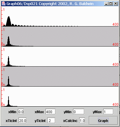
Figure 10 Spectrum of five different sinusoids of different lengths
Five sinusoids, same frequency, different lengths
Figure 10 shows the individual spectra computed for five different sinusoids, each having the same frequency, but different lengths. The combination of sampling rate and frequency was such that each sinusoid had 32 samples per cycle.
Starting at the top in Figure 10, the lengths of the five sinusoids were 80, 160, 240, 320, and 400 samples. (The lengths of the five sinusoids were multiples of 80 samples.)
Extend to 400 samples for computation
As mentioned earlier, for the cases where the actual length of the sinusoid was less than 400 samples, the length was extended to 400 samples by appending an appropriate number of samples having zero values.
(This made it easy to compute and plot the spectrum for every sinusoid over the same frequency range with the same number of points in each plot.)
The spectrum was computed and plotted for each sinusoid at 400 individual frequency points between zero and the folding frequency.
The actual averaging window
Even though the Fourier transform program averaged across 400 samples in all cases, the effective averaging length was equal to the length of the sinusoid. All product points outside that length had a value of zero and contributed nothing to the average one way or the other.
(I also applied an additional scale factor to the spectral results to compensate for the fact that fewer total samples were included in the average for the short samples. This caused the amplitude of the peak in the spectrum to nominally the same in all five cases.)
A horizontally-expanded plot
As you can see in Figure 10, there isn't much in the spectra to the right of about 50 spectral points. That is as it should be since the single sinusoid in each time series was at the low end of the spectrum.
Figure 11 shows the same data as Figure 10 with only the first 50 frequency points plotted on the horizontal axis. The remaining 350 frequency points were simply ignored. This provides a much better view of the structure of the peaks in the different spectra.
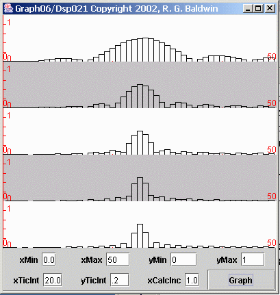
Figure 11 Spectrum of five different sinusoids of different lengths
I will begin the discussion with the bottom plot in Figure 11, which is the computed spectrum for the single sinusoid having a length of 400 samples.
A spectral line
Ideally, since the time series was a single sinusoid, the spectrum should consist of a single non-zero value at the frequency of the sinusoid, (often referred to as a spectral line) and every other value in the spectrum should be zero.
However, because the computation of the spectrum involves the computation of average values resulting from the products of sinusoids, the ideal is not always achieved. In order to achieve the ideal, it would be necessary to multiply and average over an infinite number of points. Anything short of that will result in some measurement error, as exhibited by the bottom plot in Figure 11.
(The bottom plot in Figure 11 has a large peak in the center with every second point to the left and right of center having a zero value. I will explain this structure in more detail later.)
Spectra of shorter sinusoids
Moving from the bottom to the top in Figure 11, each individual plot shows the result of shorter and shorter averaging windows. As a result, the measurement error increases and the peak broadens for each successive plot going from the bottom to the top in Figure 11. The plot at the top, with an averaging window of only 80 samples, exhibits the most measurement error and the broadest peak.
(It should be noted, however, that even the spectra for the shorter averaging windows have some zero-valued points. Once you understand the reason for the zero-valued points, you can correlate the positions of those points to the length of the averaging windows in Figure 11.)
Impact of spectral measurement errors
Now I'm going to show you the detrimental impact of such spectral measurement errors. In particular, the failure of the average to converge on zero for short averaging windows limits the spectral resolution of the Fourier transform.
Five time series with two sinusoids each
I will create five new time series, each consisting of the sum of two sinusoids with fairly closely-spaced frequencies. One sinusoid has 32 samples per cycle as in Figures 10 and 11. The other sinusoid has 26 samples per cycle.
As before, the lengths of the individual time series will be 80, 160, 240, 320, and 400 samples respectively.
Spectral analysis using Fourier transform
I will perform a Fourier transform on each of the time series in an attempt to show that the spectrum of each time series consists of two peaks, with one peak corresponding to each of the sinusoids added together to create the time series. The five spectra are shown in Figure 12.
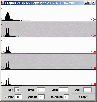
Figure 12 Spectrum of five different time series of different lengths
Discuss the longest time series first
Once again, let's begin with the plot at the bottom of Figure 12. As you can see, this spectrum shows two very distinct spectral peaks. Thus, for this amount of frequency separation and a length of 400 samples, the Fourier transform did a good job of separating the two peaks.
Resolution for shorter averaging windows
Moving upward in Figure 12, we see that the Fourier transform on the time series with a length of 320 samples (the fourth plot from the top) also did a good job of separating the two peaks.
However, separation the process began to deteriorate for lengths of 240 samples and 160 samples.
No peak separation for 80-sample average
For a length of 80 samples, the two peaks merged completely.
A horizontally-expanded view of the spectra
Figure 13 shows a horizontally-expanded view of the same spectral data to give you a better idea of the structure of the peaks. The plots in Figure 13 show only the first fifty frequency values.
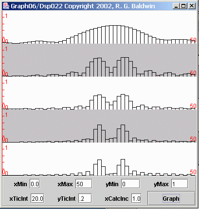
Figure 13 Spectrum of five different time series of different lengths
You may find it interesting to make a side-by-side comparison of Figures 13 and 11 in separate browser windows.
Zero-valued points in the spectra
Before leaving this topic, there are a few more things that I want to show you. If you go back and look at the bottom plot in Figure 11, you will note an interesting characteristic of that plot. In particular, starting at the peak and moving outward in both directions, every second plotted value is zero. I'm going to explain the reason for and the significance of this characteristic.
(As I mentioned earlier, there are also zero-valued points in the spectra of the time series with the shorter averaging windows. Once you understand the reason for the zero-valued points, you can correlate the positions of those points to the length of the averaging window.)
400 spectral values were computed
To begin with, the Fourier transform program that was used to compute this spectrum computed 400 values at equally spaced points between zero and the folding frequency (only the first 50 values are shown in Figure 11). Thus, each of the side-by-side rectangles in Figure 11 represents the spectral value computed at one of the 400 frequency points.
Sampling frequency was one sample per second
The sinusoid that was used as the target for this spectral analysis had 32 samples per cycle. Since this sinusoid was generated mathematically instead of being the result of sampling an analog signal, we can consider the sampling frequency to be anything that we want.
For simplicity, let's assume that the sampling frequency was one sample per second. This causes the sinusoid to have a period of 32 seconds and a frequency of 0.03125 cycles per second. (Remember this number. It will be important later.)
At a sampling rate of one sample per second, the folding frequency occurs at 0.5 cycles per second.
The computational frequency interval
Dividing the folding frequency by 400 we conclude that the Fourier transform program computed a spectral value every 0.00125 cycles per second. Given that every second spectral value is zero, the zero values occur every 0.00250 cycles per second.
Let's compute the average of some products
The top plot in Figure 14 shows the result of multiplying a cosine function having a frequency of 0.03125 cycles per second (the frequency of the sinusoid in the previous spectral analysis experiment) by a sine function having a frequency of 0.02875 cycles per second.
(This replicates one of the steps in the computation of the imaginary value in the Fourier transform).
The difference between the frequencies of the cosine function and the sine function is 0.00250 cycles per second.
(Note that this frequency difference is the reciprocal of the actual number of samples in the earlier time series, which contained 400 samples. This is also the frequency interval on which the Fourier transform produced zero-valued points for the bottom plot in Figure 11.)
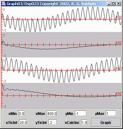
Figure 14 Average values of sinusoid products
The average of the product time series
The second plot in Figure 14 shows the average value of the time series in the first plot versus the number of samples included in the averaging window.
(This replicates another step in the computation of the imaginary value in the Fourier transform).
It is very important to note that this average plot goes to zero when 400 samples are included in the average.
Product of two cosine functions
Similarly, the third plot in Figure 14 shows the product of the same cosine function as above and another cosine function having the same frequency as the sine function described above.
(This replicates a step in the computation of the real value in the Fourier transform).
The average of the product time series
The fourth plot in Figure 14 shows the average value of the time series in the third plot.
(This replicates another step in the computation of the real value in the Fourier transform).
This average plot goes to zero at an averaging window of about 200 samples, and again at an averaging window of 400 samples.
Where do the zero values match?
The first point at which both average plots go to zero at the same point on the horizontal axis is at an averaging window of 400 samples.
(Both the real and imaginary values must go to zero in order for the spectral value produced by the Fourier transform to go to zero.)
Zero values in the spectrum for a sinusoid
Thus, the values produced by performing a Fourier transform on a single sinusoid go through zero at regular frequency intervals out from the peak in both directions. The frequency intervals between the zero values are multiples of the reciprocal of the actual length of the sinusoid on which the transform is performed.
(Note however, that you may not see the zero-valued points in the spectrum if you don't compute the spectral values at exactly those frequency values. This is the case for some of the plots in Figure 11.)
The frequency resolution of the Fourier transform
Some regard the frequency interval equal to the reciprocal of the length of the time series as being the useful resolution of the spectrum analysis process.
In other words, two peaks in the spectrum cannot be resolved if the frequency difference between them is less than the reciprocal of the length of the time series.
Illustration of frequency resolution
This is illustrated by the plots in Figure 15. Figure 15 is similar to Figure 13 with one major difference. In Figure 13, the frequency difference between the two sinusoids that made up each of the time series was rather large. In Figure 15, the frequency difference between the two sinusoids that made up each of the time series was reduced to 1/400, (the reciprocal of the length of the longest time series).
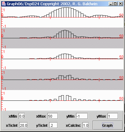
Figure 15 Illustration of frequency resolution
Each plot in Figure 15 shows the first 50 points produced by performing a Fourier transform on one of the time series. In each case, the time series consisted of the sum of two sinusoids with a frequency separation of 1/400.
A match for the frequency resolution
The length of the time series for the bottom plot was 400 samples. Thus, the separation of the two sinusoids matched the frequency resolution available by performing a Fourier transform on that time series.
As you can see, the two peaks in the spectrum were resolved by the bottom plot in Figure 15.
Insufficient frequency resolution
The other four time series were shorter, having lengths of 80, 160, 240, and 320 samples respectively, from top to bottom.
The important thing to note in Figure 15 is that the spectrum analysis performed on the 400-sample time series was successful in separating the two peaks.
However, even though the spectrum analysis on the 320-sample time series hinted at a separation of the peaks, none of the spectrum analyses on the other four shorter time series successfully separated the peaks.
This illustrates that the frequency resolution of the Fourier transform is the reciprocal of the length of the time series.
Sufficient resolution in all five cases
I'm going to show you one more picture and then call it a wrap for this lesson. Figure 16 is similar to Figure 15 with one major difference.
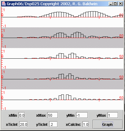
Figure 16 Illustration of frequency resolution
As before, the five plots in Figure 16 show the first 50 points produced by performing a Fourier transform on five different time series. Starting at the top, the lengths of the time series were 80, 160, 240, 320, and 400 samples.
Adequate frequency resolution in all cases
Also as before, each time series was the sum of two sinusoids with closely-spaced frequencies. However, in Figure 16, the difference between the sinusoidal frequencies was different from one time series to the next.
In Figure 16, the frequency difference for the sinusoids contained in each time series was the reciprocal of the length of that particular time series. Therefore, the frequency difference for each case matched the frequency resolution of the Fourier transform.
The frequency difference was achieved by ...
The frequency of the lower-frequency peak was the same in all five cases. Therefore, this peak should line up vertically for the five plots in Figure 16.
The frequency difference between the sinusoids was achieved by increasing the higher frequency by an amount equal to the reciprocal of the length of the time series.
Peaks were resolved in all five cases
If you examine Figure 16, you will see that the peaks corresponding to the two sinusoids were resolved for all five time series.
As would be expected, the peaks appear to be broader for the shorter time series having the lower frequency resolution.
This lesson has presented a completely non-mathematical discussion of issues involving the averaging of time series, and the impact of those issues on spectrum analysis.
Those averaging issues have an impact on other areas of DSP as well, but the detrimental effect is probably more obvious in spectrum analysis than in other areas.
Copyright 2002, Richard G. Baldwin. Reproduction in whole or in part in any form or medium without express written permission from Richard Baldwin is prohibited.
Richard has participated in numerous consulting projects and he frequently provides onsite training at the high-tech companies located in and around Austin, Texas. He is the author of Baldwin's Programming Tutorials, which has gained a worldwide following among experienced and aspiring programmers. He has also published articles in JavaPro magazine.
In addition to his programming expertise, Richard has many years of practical experience in Digital Signal Processing (DSP). His first job after he earned his Bachelor's degree was doing DSP in the Seismic Research Department of Texas Instruments. (TI is still a world leader in DSP.) In the following years, he applied his programming and DSP expertise to other interesting areas including sonar and underwater acoustics.
Richard holds an MSEE degree from Southern Methodist University and has many years of experience in the application of computer technology to real-world problems.
-end-