zz still needs
Spell check
Grammar Publication date
Programming with Adobe Flex
Defining Custom ActionScript
Components
Learn how to define and
use custom ActionScript components.
Published: zz
by Richard G. Baldwin
Flex Programming Notes # Flex0118
- Preface
- General background
information
- Preview
- Discussion and
sample code
- Run the program
- Summary
- What’s next?
- Resources
- Complete program listings
- Copyright
- About the author
Preface
General
This tutorial lesson is part of a continuing
series dedicated to programming with Adobe Flex.
An earlier lesson titled The Default
Application Container provided information on how to get started
programming with Adobe’s Flex Builder 3. (See Baldwin’s Flex programming
website.)
What you will learn
In an earlier lesson, you learned how to
define and use custom MXML components. In this lesson, you will learn how
to define and use custom ActionScript components.
Viewing tip
I recommend that you open another copy of
this document in a separate browser window and use the following links to
easily find and view the figures and listings while you are reading about them.
Figures
- Figure 1. Project file structure for
CustomComps04.
- Figure 2. Program output at startup.
- Figure 3. Output after clicking the gray
button.
- Figure 4. Output after clicking the Hello
Button.
Listings
- Listing 1. Beginning of
CustomComps04.mxml.
- Listing 2. Beginning of the class named
CustomCompA.
- Listing 3. Beginning of the constructor
for CustomCompA.
- Listing 4. Add a Button to the custom
component.
- Listing 5. Completion of the CustomCompA
constructor.
- Listing 6. Event-handler method
definitions for CustomCompA.
- Listing 7. Instantiate a button and
register a click handler.
- Listing 8. Beginning of the createObjects
event handler.
- Listing 9. Completion of the createObjects
event handler.
- Listing 10. Source code for
CustomComps04.mxml.
- Listing 11. Source code for
CustomCompA.as.
- Listing 12. Source code for
CustomCompB.as.
Supplemental material
I recommend that you also study the other
lessons in my extensive collection of online programming tutorials. You
will find a consolidated index at www.DickBaldwin.com.
General background information
What is a custom ActionScript
component?
According to Building
components in ActionScript,
"You can create reusable components by using ActionScript, and reference these components in your Adobe® Flex™ applications as MXML tags. Components created in ActionScript can contain graphical elements, define custom business logic, or extend existing Flex components.
Flex components are implemented as a class hierarchy in ActionScript. Each component in your application is an instance of an ActionScript class."
Project file structure
In this lesson, I will present and explain a
Flex project named CustomComps04. Figure 1 shows a screen shot of
the project file structure that was captured from the Navigator pane in the
Flex Builder 3 IDE.
Figure 1. Project file structure for CustomComps04.
|
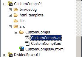
This is a relatively simple project
involving only one MXML file and two ActionScript files. However, even
though it is simple, it illustrates many of the issues involved in creating
custom ActionScript components.
Preview
Running the flex application named CustomComps04
If you have the Flash Player plug-in (version
9 or later) installed in your browser you should be able to click on CustomComps04 and
cause this application to run in your browser. (Depending on how you
have your browser configured, it should either run in a new tab or run in a new
browser window.)
If you don’t have the proper Flash
Player installed, you should be notified of that fact and given an opportunity
to download and install the Flash Player plug-in program.
Program output at startup
Figure 2 shows the program output at
startup.
Figure 2. Program output at startup.
|
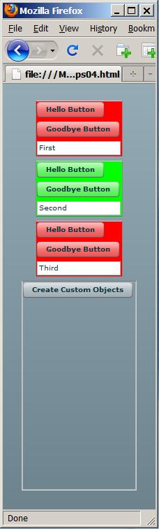
Three components from two
classes
The three objects at the top with red and
green backgrounds are three custom components instantiated from two different
ActionScript classes. (The two red components are instantiated from
the same ActionScript class.) As you will see later, these three
components were all instantiated using elements in the main MXML file.
Output after clicking the gray
button
If you click the gray button in Figure 2,
the display changes to that shown in Figure 3.
Figure 3. Output after clicking the gray button.
|
Instantiated using ActionScript
code
The bottom three custom components were
instantiated from the same two custom ActionScript classes as the top
three. However, the bottom three components were instantiated and placed
in the display using ActionScript code inside a click event handler (as
opposed to being instantiated by MXML elements).
Instantiated from both MXML
code and ActionScript code
Therefore, three of the custom components in
Figure 3 were placed there using Flex MXML code and the other three were placed
there using ActionScript code.
Behavior of the red and green
buttons
The red and green buttons have the same
behavior in all of the custom components. This behavior is illustrated in
the top custom component in Figure 4. If you click the Hello Button,
the text in the text area below the button changes to the word Hello as
shown in Figure 4.
Figure 4. Output after clicking the Hello Button.
|

If you click the Goodbye Button, the
text changes to the word Goodbye.
Discussion and sample
code
Project files
As shown in Figure 1, this Flex application
consists of the following three files:
- CustomComps04.mxml - The
main application file located in the folder named src.
- CustomCompA.as - Class
definition for the custom component with the red background, located in
the folder named CustomComps.
- CustomCompB.as - Class
definition for the custom component with the green background, located in
the folder named CustomComps.
I will explain the code in these files in
fragments. Complete listings of all three files are provided in Listing
10 through Listing 12 near the end of the lesson.
Beginning of the file named
CustomComps04.mxml
The main application file begins in Listing
1.
Listing 1. Beginning of CustomComps04.mxml.
The most interesting thing in Listing 1 is
the set of three MXML elements that instantiate the three custom components
with the red and green backgrounds shown at the top of Figure 2. (Note
that the first and third elements instantiate components from the same class
named CustomCompA.)
Two classes are essentially the
same
The classes named CustomCompA and CustomCompB
are essentially the same except for the background color. Therefore, I
will explain only CustomCompA. To make it easier to understand the
material, I will show code fragments from the main MXML file with this background color as shown in Listing 1.
I will show code fragments from the file named CustomCompA with this background color as shown in Listing 2.
Beginning of the class named
CustomCompA
The custom class named CustomCompA
begins in Listing 2.
Listing 2. Beginning of the class named CustomCompA.
You learned about package directives and the
import directives in an earlier lesson titled Integrating ActionScript and
Flex (see Baldwin’s Flex
programming website). You also learned about implicit setters in
the earlier lesson titled Defining Custom MXML Components. I will
have a little more to say about implicit setter methods later in this lesson.
What’s new here?
The only thing that is really new in Listing
2 is the fact that the CustomCompA class extends the VBox
class. The author of Building
components in ActionScript has this to say:
"All Flex visual components are derived from the ActionScript UIComponent class. To create your own components, you can create a subclass from the UIComponent class, or from any of its subclasses.
The class that you choose to use as the superclass of your custom component depends on what you are trying to accomplish. For example, you might require a custom button control. You could create a subclass of the UIComponent class, and then re-create all of the functionality built into the Flex Button class. A better and faster way to create your custom Button component is to create a subclass of the Flex Button class, and then modify it in your custom class."
I needed a container
Because I wanted to create a custom
component containing several standard components (two buttons and a text
area), I elected to extend the VBox class, which is capable of
containing other components.
A few words about implicit setter methods
Each of the yellow highlighted elements in
Listing 1 assigns a value to an attribute named startupText. The
MXML attribute named startupText corresponds to the implicit setter
method in Listing 2 named startupText.
All Flex components are instances of ActionScript
classes. When you set an attribute on a Flex component in MXML code, you
are actually calling an implicit setter that is defined in the ActionScript
class from which that Flex component was instantiated.
Functions versus methods
You may be wondering why I sometimes refer
to a code structure that contains the word function (like the implicit
setter in Listing 2) as a method and I sometimes refer to it as a
function. The essential difference is that methods are defined inside of
classes and functions are defined outside of classes. Note, however, that
I’m not very good at keeping the terminology straight while writing so
you may sometimes find that I use function when method is more appropriate and
vice versa.
Beginning of the constructor
for CustomCompA
The constructor for the class named
CustomCompA begins in Listing 3.
Listing 3. Beginning of the constructor for CustomCompA.
No constructor parameters
You will note that this constructor does not
accept any parameters. While ActionScript does support parameterized
constructors, MXML code is incapable of instantiating an object from a class
that has a parameterized constructor. Therefore, when designing a custom
component in ActionScript that you plan to instantiate using MXML code, you
must not use a parameterized constructor.
No overloaded constructors
If you have OOP experience in Java, C#, or
C++, you might suggest using an overloaded constructor with one version to be
instantiated using MXML code and another version to be instantiated using
ActionScript code. However, according to this post on
ActionScript.org, ActionScript doesn’t support overloaded constructors.
Implicit setter methods
required
As a result, when designing a custom
component in ActionScript for use with MXML code, you will need to create
implicit setter methods for all of the variables in the object that you might
otherwise initialize by passing parameters to the constructor. Then you
will need to set the corresponding attribute values in your MXML code.
Beware of timing problems
This approach can lead to some non-trivial
timing problems that I will explain in a future lesson. The reason that I
am deferring the explanation is because I need an example of the problem in
order to explain the solution. The simple custom components that I will
develop in this lesson don’t exhibit the problem.
Add a Button to the custom
component
Listing 4 uses the new operator to instantiate
an object of the Button class and assign’s that object’s
reference to a local variable named helloButton.
Listing 4. Add a Button to the custom component.
Then Listing 4 uses the dot operator to set
the value of a button property named label. The value of this
property is the text that appears on the face of the button as shown in Figure
2.
Register an event listener
Then Listing 4 calls the addEventListener
method on the Button object to cause the method named helloButtonHandler
to be called each time the button fires a MouseEvent.CLICK event.
Add the button to the VBox
Finally, Listing 4 calls the addChild
method of the VBox class to add the button object to the
container. The addChild method causes the object to be added to
the container according to the layout rules currently in force for the
container. For a VBox container, for example, the default layout
is to arrange the components vertically with left justification. as shown by
the first custom component in Figure 2.
Completion of the CustomCompA
constructor
The remainder of the constructor is shown in
Listing 5.
Listing 5. Completion of the CustomCompA constructor.
Another Button object
Listing 5 begins by instantiating another Button
object, setting its label, registering a click event handler, and adding
it to the container as shown by the top component in Figure 2.
Add a TextArea object
Finally, Listing 5 instantiates a TextArea
object, sets its width and height, and adds it to the VBox.
Note that the reference to this object is stored
in the instance variable that is declared in Listing 2 instead of being stored
in a variable that is local to the constructor. This is because the two
event handler methods need access to the variable and it would be out of scope
if declared inside the constructor.
Event handler method
definitions
Finally, Listing 6 defines the two
event-handler methods that were registered on the buttons in Listing 4 and
Listing 5.
Listing 6. Event-handler method definitions for CustomCompA.
Depending on which method is called, the
reference to the TextArea object is used to set the text property
of the object to either Hello (as shown in Figure 4) or Goodbye.
The end of the class definition
Listing 6 also signals the end of the
definition for the class named CustomCompA. As mentioned earlier,
the class named CustomCompB, which can be see in its entirety in Listing
12, is essentially the same except for the background color being green instead
of red.
Instantiate a button with a
click handler
Returning now to the file named CustomComps04.mxml,
Listing 7 adds a VBox container that contains a button. A click
event handler is registered on the button.
Listing 7. Instantiate a button and register a click handler.
Note that the id attribute value for
the VBox container is set to vbox. This id will be used
later by the ActionScript code to access the container.
The VBox container is identified by
the rectangular outline shown at the bottom of Figure 2. (This outline
was produced by setting the value of the borderStyle attribute to
"inset" in Listing 7.) The gray button at the top of that
outline is the button instantiated in Listing 7.
Register a click event handler
on the button
Listing 7 uses MXML code to register a click
event handler function named createObjects on the new button.
Beginning of the createObjects
event handler
The beginning of the function named createObjects
is shown inside an MXML Script element in Listing 8.
Listing 8. Beginning of the createObjects event handler.
This function is executed whenever the user
clicks the gray button in Figure 2.
Instantiate a CustomCompB
object
Listing 8 uses the new operator to
instantiate a new custom component of the class named CustomCompB (see
Listing 12). Listing 8 also calls the implicit setter named startupText
to cause the string "Fourth" to be displayed in the text area
belonging to the component. This is shown in the green custom component
immediately below the gray button in Figure 3.
Finally, Listing 8 calls the addChild
method to cause the custom component to be added to the container with the vbox
id immediately below the gray button.
Completion of the createObjects
function
The remainder of the createObjects
function is shown in Listing 9.
Listing 9. Completion of the createObjects event handler.
This code instantiates an object of the CustomCompA
class and adds it to the VBox container near the bottom of Figure
3. Then it instantiates another object of the CustomCompB class
and adds it at the bottom of the VBox container.
Note the different layouts
The top three custom components and the VBox
container are arranged vertically and centered horizontally in the browser
window as shown in Figure 3. This is the default layout for the MXML
Application container.
The gray button and the bottom three custom
components are arranged vertically and left justified in the VBox
container. This is the default layout for a VBox container.
The end of the application
Listing 9 signals the end of the
application.
Run the
program
I encourage you to copy the code from
Listing 10, Listing 11, and Listing 12. Use that code to create a Flex
project. Compile and run the project. Experiment with the code,
making changes, and observing the results of your changes. Make certain
that you can explain why your changes behave as they do.
Summary
In an earlier lesson, you learned how to
define and use custom MXML components. In this lesson, you learned how to
define and use custom ActionScript components.
What’s
next?
So far, most of the applications in this
series of lessons have been somewhat trivial. Those applications were
designed to illustrate programming concepts as opposed to producing a useful
application. In the next lesson, I will explain a rather significant
application. In particular, I will show you how to define custom
ActionScript components that can be used to create self-grading online tests.
Resources
- Baldwin’s
Flex programming website
- Adobe
Flex 3 Home
- Download
free open-source Adobe Flex 3.4 SDK
- Download Adobe Flex
Builder 3 Professional for students
- Download
Adobe Flash Builder 4 beta
- Download
Adobe Flash Player 9 (or later versions)
- Download Adobe Air
- Download various Adobe
products
- Flex Developer Center
- Flex in a
Week video training
- Adobe
Flex Builder 3 - Getting Started
- Getting
Started with Flex 3 - online O’Reilly book by Jack Herrington and
Emily Kim
- Adobe
Flex 3 Help
- Adobe Flex 3.4
Language Reference
- Building
and Deploying Flex 3 Applications
- Programming
ActionScript 3.0
- ActionScript
language and syntax
- Flex
Quick Start: Getting started
- ActionScript
3 guides, tutorials, and samples
- Flex.org
- Wikipedia on MXML
Complete
program listings
Complete listings of the
source code discussed in this lesson is provided in Listing 10 through Listing
12 below.
Listing 10. Source code for CustomComps04.mxml.
Listing 11. Source code for CustomCompA.as.
Listing 12. Source code for CustomCompB.as.
Copyright
Copyright 2009, Richard G. Baldwin.
Reproduction in whole or in part in any form or medium without express written
permission from Richard Baldwin is prohibited.
About the
author
Richard Baldwin is a college professor (at
Richard has participated in numerous
consulting projects and he frequently provides onsite training at the high-tech
companies located in and around
In addition to his programming expertise,
Richard has many years of practical experience in Digital Signal Processing
(DSP). His first job after he earned his Bachelor’s degree was
doing DSP in the Seismic Research Department of
Richard holds an MSEE degree from
Southern
-end-