
 |
|
Published: October 13, 2009
Updated: December 13, 2009
Validated with Amaya
By Richard G. Baldwin
Flex Programming Notes # 0104
This lesson is one in a series of tutorial lessons dedicated to programming with Adobe Flex.
An earlier lesson titled The Default Application Container provided information on how to get started programming with Adobe's Flex Builder 3.
I recommend that you open another copy of this document in a separate browser window and use the following links to easily find and view the figures and listings while you are reading about them.
I also recommend that you study the other lessons in my extensive collection of online programming tutorials. You will find a consolidated index at www.DickBaldwin.com.
Once you learn how to program using ActionScript 3 or a later version, you will probably integrate ActionScript code with your Flex code to provide complex event handling. In the meantime, it is possible to provide simple event handlers in Flex without the requirement to write ActionScript code. I will illustrate and explain that capability in this lesson.
The project that I will explain in this lesson is named SliderChangeEvent01. I encourage you to run the online version of the program before continuing with this lesson.
Browser image at startup
The application starts running in Flash Player (version 9 or later) with the image shown in Figure 1 appearing in the browser.
Figure 1. Browser image at startup.
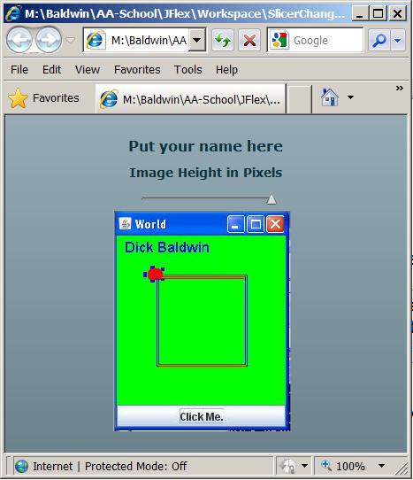
The image that you see in Figure 1 consists of two Label controls, one HSlider control, and one Image control arranged vertically and centered in the browser window.
The Application container
The root of a Flex application is a container that is often called the Application container. (You can learn all about the Application container at Adobe Flex 3.4 Language Reference.)
Briefly, the Application container, (which corresponds to the root element in the Flex XML code), holds all other containers and components.
Vertical layout
By default, the Application container lays out all of its children vertically as shown in Figure 1. The default vertical layout occurs when the layout attribute is not specified as is the case in this application. According to the Adobe Flex 3.4 Language Reference, the layout property:
"Specifies the layout mechanism used for this application. Applications can use "vertical", "horizontal", or "absolute" positioning. Vertical positioning lays out each child component vertically from the top of the application to the bottom in the specified order. Horizontal positioning lays out each child component horizontally from the left of the application to the right in the specified order. Absolute positioning does no automatic layout and requires you to explicitly define the location of each child component. The default value is vertical."
A toolTip on the slider
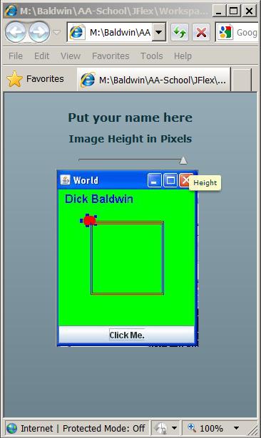
If you point to the slider with your mouse, a tool tip showing the word Height will appear as shown in Figure 2.
Figure 2. A toolTip on the slider.
The slider's thumb
The little triangle that you see on the slider in these images is often referred to as the slider's thumb.
As you will see later, the position of the thumb is intended to represent the height of the image below the slider. The left end of the slider represents a height of 100 pixels and the right end represents a height of 250 pixels (which just happens to be the actual height of the raw image).
Changing the height of the image
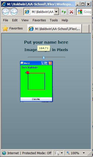
If you grab the thumb with the mouse and move it to the left or the right, two obvious visual effects occur. The first is that the value represented by the current position of the thumb is displayed above the thumb as shown in Figure 3.
Figure 3. Changing the height of the image.
The second visual effect
The second visual effect of moving the thumb is that the height of the image changes to the value represented by the position of the thumb on the slider. (By default, the value of an Image property named maintainAspectRatio is true. Therefore, when the height is changed, the width changes in a proportional manner.)
Note that the upper-left corner of the image remains anchored to the same point as the height of the image changes as shown in Figure 3.
Once you create your new Flex Project, there are at least three ways that you can create your layout using Flex Builder 3:
Expose the components tab
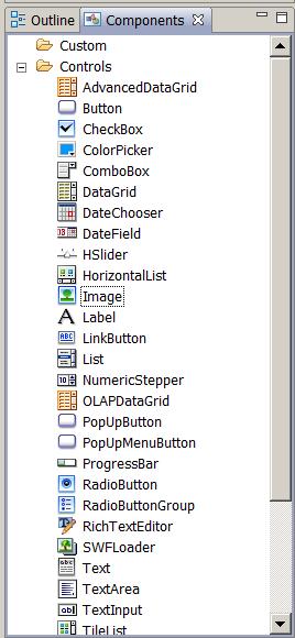
When you select the Design tab in the upper-middle window of the IDE, the lower-left window changes to the appearance shown in Figure 4 with the Components tab exposed.
Figure 4. Components tab exposed.
A list of available components
Although they aren't all shown in Figure 4 due to space limitations, the Components tab lists all of the components that you can use in your Flex application grouped into the following categories:
Some of the controls that are available are shown in Figure 4, but there were too many to fit on my screen.
Expose the design window
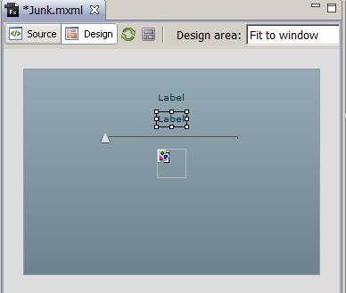
Selecting the Design tab mentioned above also exposes the design window shown in Figure 5.
Figure 5. Drag controls onto the Design tab.
Drag components onto the Design tab
You can drag components from the Components tab shown in Figure 4 onto the Design tab shown in Figure 5 to create your layout in Flex Builder's design mode. As you do that, the corresponding XML code is automatically generated for you.
For example, Figure 5 shows the result of dragging two Label controls, one HSlider control, and one Image control from the Components tab of Figure 4 to the Design tab of Figure 5. (No attempt has been made to set property values on any of the controls shown in Figure 5.).
XML code before setting properties
If you select the Source tab at this point, you will see the XML code shown in Listing 1.
Listing 1. XML code before setting
properties.
<?xml version="1.0" encoding="utf-8"?>

<mx:Application xmlns:mx="http://www.adobe.com/2006/mxml">
    <mx:Label text="Label"/>
    <mx:Label text="Label"/>
    <mx:HSlider/>
    <mx:Image/>

</mx:Application>
|
Compile and run
As you can see, the XML code in Listing 1 is pretty sparse. You could compile and run the application at this point. All you would see would be two labels containing the text Label and a slider covering the default numeric range from 0 to 10.
Put some meat on the bones
We will need to put some meat on the bones of this skeleton XML code in order to create our Flex application. We can accomplish that by setting attribute values that correspond to various properties of the controls.
Setting attribute values
Once again, we have three choices:
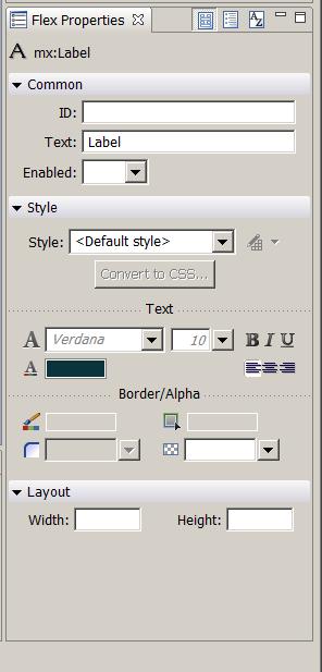
Figure 6. The Flex Properties tab exposed.
The Flex Properties tab
When you select the Design tab shown in Figure 5, the Flex Properties tab shown in Figure 6 appears in the bottom-right of the IDE.
The appearance of the Flex Properties tab depends on which component is selected in the Design tab. Figure 5 shows one of the Label controls selected, and Figure 6 shows the Flex Properties tab corresponding to a Label control.
A variety of user input controls
The Flex Properties tab contains a variety of user input controls that allow you to specify values for many of the commonly used properties that are allowed for the selected component.
Note, however, that the documentation for the Label control lists many properties that are not supported by the Flex Properties tab shown in Figure 6. You can increase the number of properties shown in the tab by selecting one of the controls at the top of the tab that converts the display into an alphabetical list of properties. However, even this doesn't seem to show all of the properties defined by and inherited by some components.
If you need to set properties that are not supported by the Flex Properties tab, you probably have no choice but to select the Source tab shown in Figure 5 and write XML code for those properties.
Will explain the code in fragments
I will explain the code for this Flex application in fragments. A complete listing of the application is provided in Listing 5 near the end of the lesson.
Beginning of XML code for SliderChangeEvent01
The primary purpose of this application is to illustrate the use of inline event handling for slider change events.
The application begins in Listing 2 which shows the beginning of the Application element and the two complete Label elements shown at the top of Figure 1.
Listing 2. Beginning of XML code for
SliderChangeEvent01.
<?xml version="1.0" encoding="utf-8"?>

<mx:Application xmlns:mx="http://www.adobe.com/2006/mxml">

    <mx:Label text="Put your name here" fontSize="16"
        fontWeight="bold"/>

    <mx:Label text="Image Height in Pixels"
        fontWeight="bold" fontSize="14"/>
|
Make it easy - drag and drop
The two Label elements were created by dragging Label controls from the Components tab shown in Figure 4 onto the Design tab shown in Figure 5. Then the attribute values were set using the Flex Properties tab shown in Figure 6.
The attributes shown in Listing 2 represent common properties of a text label and shouldn't require further explanation.
Create and condition the slider
Listing 3 adds a horizontal slider (HSlider) control to the application and sets the attributes that control both its appearance and its behavior.
Listing 3. Create and condition the
slider.
    <mx:HSlider minimum="100" maximum="250" value="250"
        toolTip="Height"
        change="myimg.height=event.currentTarget.value"
        liveDragging="true" />
|
The slider is a little more complicated than a label and deserves a more thorough explanation.
The numeric properties
Recall that a slider represents a range of numeric values. The position of the thumb at any instant in time selects a value from that range. The following three attributes shown in Listing 3 deal with the slider and its numeric range:
The toolTip property
As you have probably already guessed, the value of the toolTip property specifies the text that appears in the tool tip when it appears as shown in Figure 2.
The change property
This is where thing get a little more interesting. As the user moves the thumb to the left or right, the slider fires a continuous stream of change events. You might think of this as the slider yelling out "Hey, the position of my thumb has been changed." over and over as the thumb is being moved. (Also see the discussion of the liveDragging property later.)
An event handler
The value that is assigned to the change attribute in Listing 3 is often referred to as an event handler. This value specifies what the application will do each time the slider fires a change event.
Three ways to handle events in Flex
According to the Handling events section of Flex Quick Start: Getting started, there are three ways to handle event notifications:
The XML code in Listing 3 uses the inline approach.
The inline approach
The advantage of using the inline approach, (at least insofar as my Introduction to XML, students are concerned), is that it doesn't require you to create a Script element within the XML or to create a separate ActionScript file.
Handling the slider's change event
Now consider the code highlighted in yellow in Listing 3. The code within the quotation marks can be a little hard to explain, but I will give it a try.
Think of it this way
There is a Flex class named Event. The reference to event in Listing 3 is a reference to an object of the Event class that comes into being each time the slider fires a change event.
The Event object encapsulates a property named currentTarget, which is described in the Flex 3.4 documentation as follows:
The currentTarget is the slider"The object that is actively processing the Event object with an event listener. For example, if a user clicks an OK button, the current target could be the node containing that button or one of its ancestors that has registered an event listener for that event."
In this application, the value of currentTarget points to the slider which is firing change events as the user moves the thumb.
The value property of an HSlider object
The slider is an object of the HSlider class, which has a property named value. The value property contains the current position of the thumb and is a number between the minimum and maximum property values.
Get the current value of the thumb
Therefore, each time the slider fires a change event, the code on the right side of the assignment operator within the highlighted quotation marks in Listing 3 gets the numeric value that indicates the current position of the thumb.
Cause the image to be resized
This value is assigned to the height property of the image, causing the overall size of the image to be adjusted, if necessary, to match the current position of the slider's thumb. (I could go into more detail as to the sequence of events that causes the size of the image to change, but I will leave that as an exercise for the student.)
That leaves one more attribute or property for us to discuss in Listing 3: liveDragging. This one is much easier to understand.
The Flex 3.4 documentation has this to say about the liveDragging property:
"Specifies whether live dragging is enabled for the slider. If false, Flex sets the value and values properties and dispatches the change event when the user stops dragging the slider thumb. If true, Flex sets the value and values properties and dispatches the change event continuously as the user moves the thumb. The default value is false."
If liveDragging is false...
If you were to modify the code in Listing 3 to cause the value of the liveDragging property to be false (or simply not set the attribute value to true), the slider would only fire change events each time the thumb stops moving (as opposed to firing a stream of events while the thumb is moving). This, in turn, would cause the size of the image to change only when the thumb stops moving instead of changing continuously while the thumb is moving.
An Image control
The Flex 3.4 documentation tells us:
"The Image control lets you import JPEG, PNG, GIF, and SWF files at runtime. You can also embed any of these files and SVG files at compile time by using @Embed(source='filename')."
The primary output that is produced by compiling a Flex application is an swf file that can be executed in Flash Player (version 9 or later).
The documentation goes on to explain that by using @Embed, you can cause resources such as images to be embedded in the swf file.
The advantage to embedding is that embedding the resource eliminates the requirement to distribute the resource files along with the swf files. The disadvantage is that it causes the swf file to be larger.
Import an image
Listing 4 imports an image from the file named myimage.jpg that is located in the src folder of the project tree. This image is embedded in the swf file when the Flex application is compiled.
Listing 4. Import an image.
    <mx:Image id="myimg" source="@Embed('myimage.jpg')"
        height="250">
    </mx:Image>

</mx:Application>
|
The id property
Setting the id property on the image to myimg makes it possible to refer to the image in the change-event code in Listing 3.
(Note that there is no requirement to set the value of the id property to be the same as the name of the image file as was done in Listing 4.)
The height property
Setting the height property of the image to 250 pixels in Listing 4 causes the image height to be 250 pixels when it is first displayed as shown in Figure 1.
The end of the application
Listing 4 contains the closing tag for the Application element signaling the end of the Flex application.
I encourage you to run the online version of the program. Then copy the code from Listing 5. Use that code to create a Flex project. Compile and run the project. Experiment with the code, making changes, and observing the results of your changes. Make certain that you can explain why your changes behave as they do.
In this lesson, you learned how to handle slider change events as inline Flex XML code without writing separate ActionScript code.
Listing 5. Complete listing of
SliderChangeEvent01.
<?xml version="1.0" encoding="utf-8"?>

<!--
SliderChangeEvent01
Illustrates the use of inline event handling for slider
change events.
-->

<mx:Application xmlns:mx="http://www.adobe.com/2006/mxml">
    <mx:Label text="Put your name here" fontSize="16"
        fontWeight="bold"/>

    <mx:Label text="Image Height in Pixels"
        fontWeight="bold" fontSize="14"/>

    <mx:HSlider minimum="100" maximum="250" value="250"
        toolTip="Height"
        change="myimg.height=event.currentTarget.value"
        liveDragging="true" />

    <mx:Image id="myimg" source="@Embed('myimage.jpg')"
        height="250">
    </mx:Image>
</mx:Application>
|
Copyright 2009, Richard G. Baldwin. Reproduction in whole or in part in any form or medium without express written permission from Richard Baldwin is prohibited.
Richard has participated in numerous consulting projects and he frequently provides onsite training at the high-tech companies located in and around Austin, Texas. He is the author of Baldwin's Programming Tutorials, which have gained a worldwide following among experienced and aspiring programmers. He has also published articles in JavaPro magazine.
In addition to his programming expertise, Richard has many years of practical experience in Digital Signal Processing (DSP). His first job after he earned his Bachelor's degree was doing DSP in the Seismic Research Department of Texas Instruments. (TI is still a world leader in DSP.) In the following years, he applied his programming and DSP expertise to other interesting areas including sonar and underwater acoustics.
Richard holds an MSEE degree from Southern Methodist University and has many years of experience in the application of computer technology to real-world problems.
-end-