|
|
Published: October 15, 2009
Updated: December 13, 2009
Validated with Amaya
by Richard G. Baldwin
Flex Programming Notes # 0108
This tutorial lesson is part of a continuing series dedicated to programming with Adobe Flex.
An earlier lesson titled The Default Application Container provided information on how to get started programming with Adobe's Flex Builder 3. (See Baldwin's Flex programming website.)
I recommend that you open another copy of this document in a separate browser window and use the following links to easily find and view the figures and listings while you are reading about them.
I recommend that you also study the other lessons in my extensive collection of online programming tutorials. You will find a consolidated index at www.DickBaldwin.com.
A container is a special kind of component that is capable of containing other components, including other containers. Not every component is a container. For example, if you attempt to write XML code to place another component inside of a Button element, you will get an error at compile time.
Categories of components
The Components tab in the Flex Builder 3 IDE, which I explained in an earlier lesson, shows the following categories of components:
I don't believe that the word container appears anywhere on the Components tab. Thus, a container is a component that falls within one or more of the broad categories listed above.
Where are the containers?
Most, if not all of the components in the Layout category are containers. Some, and possibly all of the components in the Navigators category are containers as well.
I doubt that there are containers in the Controls category but I can't be sure, and I don't know about the Charts category.
The only way to know for sure if a component is also a container is to examine the documentation (see Resources) for the component.
In this lesson, we will explore a component named TabNavigator that resides in the Navigators category. In addition, we will explore the use of transition effects to move from one tab to another tab.
The project that I will explain in this lesson is named TabTransitions01. I recommend that you run the online version of the program before continuing with this tutorial.
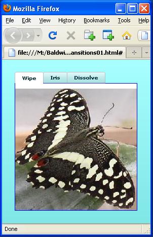
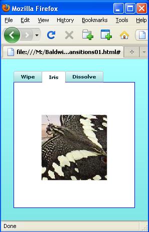
Browser image at startup
The application starts running in Flash Player 9 with the TabNavigator image shown in Figure 1 appearing in the browser.
Figure 1. Browser image at startup.
Three separate images
As you will see later, this Flex application populates three VBox containers with separate images (two butterflies and one snow scene) and attaches each of the three VBox containers to one of the tabbed panels in a TabNavigator container.
The butterfly image that you see in Figure 1 appears whenever the tab labeled Wipe is selected.
Result of selecting the Iris tab
Figure 2 shows the result of selecting the tab labeled Iris.
Figure 2. Result of selecting the Iris tab.
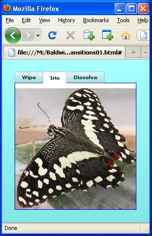
Note that the butterfly in Figure 2 is facing the opposite direction from the butterfly in Figure 1. These two images came from two different image files.
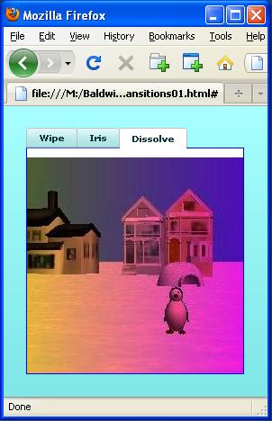
Result of selecting the Dissolve tab
The result of selecting the tab labeled Dissolve is shown in Figure 3.
Figure 3. Result of selecting the Dissolve tab.
Why the strange tab labels?
By now you may be wondering what the following tab labels have to do with two butterfly images and a snow scene image.
The tab labels and the images are unrelated
Actually the labels on the tabs have nothing to do with the images displayed on the tabs. You can display just about anything on a tab that you want to display on a tab. For example, you could display a Grid containing numeric values on a tab if that made sense for your application.
The images displayed on the tabs by this application are simply images of convenience that I found in my archive of image files. A tab's panel is a repository on which you can construct all kinds of interesting combinations of components.
Why use a TabNavigator
The primary benefit of a TabNavigator is that it allows you to make better use of a limited amount of real estate on the user's computer screen. (Only enough real estate for the display of one tab panel at a time is required.)
Tab labels are based on transition effects
The labels on the tabs in Figure 1 are related to how the application transitions from the current view of one tab to the view of a different tab when the second tab is selected. The transition effects assigned to each of the three tabs going from left to right are:
These are the names of Flex classes, and you will see the names being used in the XML code later.
Screen shots fail to do justice to transition effects
It is not possible to do justice to the transition effects using simple static screen shots of the type shown in Figure 1 through Figure 3. To fully appreciate the effects, you will simply have to run the program.
However, Figure 4 attempts to show a snapshot of the Iris transition effect during a transition.
Figure 4. Snapshot during a transition.
Description of the Iris effect
Here is what the Flex documentation (see Resources) has to say about the Iris effect:
"The Iris effect animates the effect target by expanding or contracting a rectangular mask centered on the target. The effect can either enlarge the mask from the center of the target to expose the target, or contract the mask toward the center to obscure the target."
Figure 4 shows a snapshot of the mask that I caught midstream between fully obscuring the target and fully exposing the target.
I will explain this Flex application in fragments. A complete listing of the XML code is provided in Listing 7 near the end of the lesson.
Beginning of the XML code
The XML code for the application begins in Listing 1. In addition to creating the Application container element and setting its background color, Listing 1 defines the transition effects that will be used later for the Wipe tab shown in Figure 1.
Listing 1. Definition of transition
effects for the Wipe tab.
<?xml version="1.0" encoding="utf-8"?>

<mx:Application xmlns:mx="http://www.adobe.com/2006/mxml"
    backgroundColor="#99FFFF">

    <mx:WipeLeft id="wipeIn" duration="1000" />
    <mx:WipeRight id="wipeOut" duration="1000" />
|
The transition effect with the attribute value of wipeIn will be used when the Wipe tab is selected and needs to display its contents. Note that wipeIn is an attribute of an element named WipeLeft.
Description of the WipeLeft class
Here is part of what the Flex documentation has to say about the WipeLeft class.
"The WipeLeft class defines a bar wipe left effect. The before or after state of the component must be invisible.You often use this effect with the showEffect and hideEffect triggers. The showEffect trigger occurs when a component becomes visible by changing its visible property from false to true. The hideEffect trigger occurs when the component becomes invisible by changing its visible property from true to false."
Used with the showEffect trigger
As you will see later in Listing 5, the wipeIn effect is used with the showEffect trigger when the Wipe tab is selected. If you run the program, you will see that selecting the Wipe tab causes the image of the butterfly shown in Figure 1 to fill the display panel by exposing the image from right to left across the panel.
Description of the WipeRight class
The transition effect with the attribute value of wipeOut will be used when another tab is selected and the Wipe tab needs to relinquish the display area. Note that wipeOut is an attribute of an element named WipeRight.
Here is part of what the Flex documentation has to say about the WipeRight class.
"The WipeRight class defines a bar wipe right effect. The before or after state of the component must be invisible.You often use this effect with the showEffect and hideEffect triggers. The showEffect trigger occurs when a component becomes visible by changing its visible property from false to true. The hideEffect trigger occurs when the component becomes invisible by changing its visible property from true to false."
This is essentially the same as the description of the WipeLeft class except that the word left has been replaced by the word right. (Note that Flex also provides classes named WipeUp and WipeDown with very similar descriptions.)
Used with the hideEffect trigger
Once again, as you will see later in Listing 5, the wipeOut effect is used with the hideEffect trigger when the Wipe tab is de-selected (by selecting another tab). If you run the program you will see that de-selecting the Wipe tab causes the image of the butterfly shown in Figure 1 to be removed from the display panel by erasing the image from left to right across the panel.
Time duration of the transition effect
Both of the elements that are defined in Listing 1 define an attribute with the name duration and a value of 1000. This is the time in milliseconds that the transition will play from beginning to end. Thus, in this application, the wipeIn and wipeOut transitions will each require one second to complete.
Definition of transition effects for the Iris tab
Listing 2 defines the transition effects for the Iris tab shown in Figure 2.
Listing 2. Definition of transition
effects for the Iris tab.
    <mx:Iris id="irisOut" duration="1000" />
    <mx:Iris id="irisIn" duration="1000" />
|
I provided a description of the Iris effect from the Flex documentation earlier.
Although the description in the documentation doesn't say so, you can also use this effect with the showEffect and hideEffect triggers.
Selecting the Iris tab
The transition effect with the id value of irisIn will be played when the Iris tab is selected. If you run the program, you will see that when the tab is selected, the image of the butterfly in Figure 2 is first exposed as a tiny dot in the center of the display panel. Over the course of the next one second, the rectangular mask described earlier expands to expose the entire image of the butterfly.
De-selecting the Iris tab
The transition effect with the id of irisOut will be played when the Iris tab is de-selected. Over the course of one second, the rectangular mask described earlier shrinks to completely hide the image of the butterfly
Definition of transition effects for the Dissolve tab
Listing 3 defines the transition effects for the Dissolve tab shown in Figure 3. Listing 3 creates two transition effects, both of which are objects of the Dissolve class.
Listing 3. Definition of transition
effects for the Dissolve tab.
    <mx:Dissolve id="dissolveOut" duration="2000"
        alphaFrom="1.0" alphaTo="0.0"/>

    <mx:Dissolve id="dissolveIn" duration="2000"
        alphaFrom="0.0" alphaTo="1.0"/>
|
The alphaFrom and alphaTo attributes
I have explained the concept of the alpha property in earlier lessons on my Flex programming website (see Resources). Here is a brief excerpt from the Flex documentation regarding the alphaTo property for the Dissolve effect.
"Final transparency level between 0.0 and 1.0, where 0.0 means transparent and 1.0 means fully opaque."
The description of the alphaFrom property is essentially the same except that the word Final is replaced by the word Initial.
The transparency effect
Referring back to listing 3, the transparency effect with the id value of dissolveOut is fully opaque initially (alphaFrom="1.0") and ends up being totally transparent (alphaTo="0.0").
The transparency effect with the id value of dissolveIn is just the opposite. It is initially totally transparent and ends up being fully opaque.
In both cases, the transition requires two seconds to play because the duration attribute is set to 2000.
Description of the Dissolve class
Here is part of what the Flex documentation has to say about the Dissolve class:
"Animate the component from transparent to opaque, or from opaque to transparent. When the Dissolve effect is played, it does the following:
- When the effect begins, it creates an opaque rectangle. The rectangle floats above the target component, its color matches the Dissolve.color property, and its alpha property is initially set to (1.0 - Dissolve.alphaFrom).
- As the effect plays, the alpha property of the rectangle animates from (1.0 - alphaFrom) to (1.0 - alphaTo). As the rectangle becomes more and more opaque, the content underneath it gradually disappears.
- When the effect finishes, the rectangle is destroyed.
When the target object is a Container, the Dissolve effect applies to the content area inside the container. The content area is the region where the container's background color is visible."
I may be wrong but...
It seems to me that the author of this description got things backwards in item 2 above. The description in item 2 seems to be the reverse of the behavior demonstrated by this application.
Also note that if you set the alphaFrom and alphaTo values to anything other than 0.0 or 1.0, you will experience a sudden change in transparency at the beginning or the end of the transition, which probably won't be what you want.
Finally, if you set the Dissolve.color property to anything other than the default color of white, you may see an abrupt color change at the beginning or the end of the transition. That, of course, will depend on the color that you are transitioning from or to.
Use with the showEffect and hideEffect triggers
Although the description provided above doesn't say so, you can also use this effect with the showEffect and hideEffect triggers.
The transition effect with the id value of dissolveIn (see Listing 3) will be played when the Dissolve tab is selected. If you run the program, you will see that when the tab is selected, the image of the snow scene in Figure 3 is transparent. Over the course of the next two seconds, the snow scene becomes fully opaque.
The transition effect with the id of DissolveOut will be played when the Dissolve tab is de-selected. Over the course of two seconds, the snow scene becomes totally transparent.
The ViewStack navigator container
To understand the documentation for the TabNavigator container, we must first have some understanding of the superclass named ViewStack.
Here is part of what the documentation has to say about the ViewStack class.
"A ViewStack navigator container consists of a collection of child containers stacked on top of each other, where only one child at a time is visible. When a different child container is selected, it seems to replace the old one because it appears in the same location. However, the old child container still exists; it is just invisible."
If you run the prograsm, you will see that when a different tab (a different child container) is selected, it seems to replace the old one because it appears in the same location. Of course, in this application, the replacement is not instantaneous because the application plays transition effects each time a tab is selected or de-selected.
No user interface
Continuing with the discussion of the ViewStack documentation, we read:
"A ViewStack container does not provide a user interface for selecting which child container is currently visible. Typically, you set its selectedIndex or selectedChild property in ActionScript in response to some user action. Alternately, you can...
We could do that but...
We could do what is described above. However, that wouldn't satisfy our objective, which is to learn how to use the TabNavigator class. It would also require that we write some ActionScript code to make the selection.
Some good advice
Therefore, we will take the following advice from the documentation and use a TabNavigator container instead of a ViewStack container.
"You might decide to use a more complex navigator container than the ViewStack container, such as a TabNavigator container or Accordion container. In addition to having a collection of child containers, these containers provide their own user interface controls for navigating between their children."
Inherited behavior
Because TabNavigator is a subclass of the ViewStack class, it inherits the following behavior. We will take advantage of this behavior with respect to the application of transition effects when the user selects a new tab.
"When you change the currently visible child container, you can use the hideEffect property of the container being hidden and the showEffect property of the newly visible child container to apply an effect to the child containers. The ViewStack container waits for the hideEffect of the child container being hidden to complete before it reveals the new child container."
The TabNavigator container
Now that we have learned about some of the inherited behavior of a TabNavigator, let's see what the documentation tells us about the specialized aspects of a TabNavigator.
"The TabNavigator container extends the ViewStack container by including a TabBar container for navigating between its child containers."
A TabBar container
Briefly, the documentation tells us:
"The TabBar control lets you create a horizontal or vertical group of tab navigation items by defining the labels and data associated with each tab."
This is what produces the row of tabs that you see across the top of Figure 1.
A collection of child containers
Continuing with the description of the TabNavigator class, we read:
"Like a ViewStack container, a TabNavigator container has a collection of child containers, in which only one child at a time is visible. Flex automatically creates a TabBar container at the top of the TabNavigator container, with a tab corresponding to each child container. Each tab can have its own label and icon. When the user clicks a tab, the corresponding child container becomes visible as the selected child of the TabNavigator container."
Applying transition effects
The documentation confirms what we already know from the earlier description of the ViewStack class:
"When you change the currently visible child container, you can use the hideEffect property of the container being hidden and the showEffect property of the newly visible child container to apply an effect to the child containers. The TabNavigator container waits for the hideEffect of the child container being hidden to complete before it reveals the new child container."
Skeleton XML code for a TabNavigator
Listing 4 shows the skeleton code necessary to create a TabNavigator.
Listing 4. Skeleton XML code for a
TabNavigator.
    <mx:TabNavigator>

        <!-- Insert a container element. -->

        <!-- Insert another container element. -->

        <!-- Insert another container element. -->

        <!-- Insert more container elements. -->

    </mx:TabNavigator>
|
The TabNavigator element consists of...
Briefly, the element shown in Listing 4 consists of an element named TabNavigator containing other containers. You can put any mixture of containers inside the TabNavigator element. You can even nest TabNavigator elements if that suits your fancy, producing something that looks like Figure 5.
Figure 5. Nested TabNavigator containers.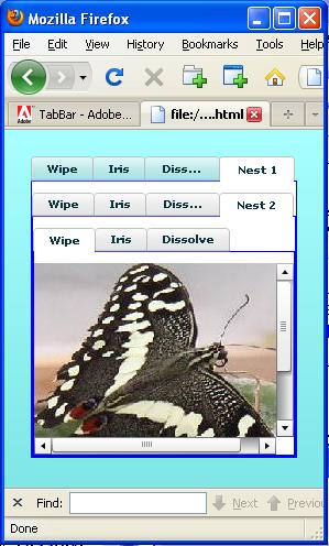
Beginning of the TabNavigator element
The beginning of the TabNavigator element is shown in Listing 5. Note that I elected to decorate my TabNavigator with a blue border having a thickness of only one pixel.
Listing 5. Beginning of the TabNavigator
element.
    <mx:TabNavigator borderThickness="1"
        borderColor="#0000FF">

        <mx:VBox label="Wipe"
             showEffect="{wipeIn}"
             hideEffect="{wipeOut}">
            <mx:Image
                source="@Embed('rightbutterfly.jpg')"/>
        </mx:VBox>
|
A VBox container
I elected to populate my TabNavigator with three VBox containers, the first of which is shown in Listing 5. The label attribute in Listing 5 specifies the label that appears in the leftmost tab in Figure 1.
The showEffect and hideEffect attributes
The showEffect and hideEffect attributes in Listing 5 specify the use of the transition effects identified as wipeIn and wipeOut in Listing 1.
The showEffect trigger occurs when the Wipe tab is selected and the hideEffect trigger occurs when the Wipe tab is de-selected (because another tab is selected).
When these triggers occur, one or the other of the two effects defined in Listing 1 is played.
Note that the attribute values for the showEffect and hideEffect attributes are surrounded by curly braces (not parentheses).
Encapsulate an image in the VBox
You learned how to import images from image files in an earlier lesson, so no explanation of the code that puts the image in the VBox in Listing 5 should be required.
The remaining VBox containers
The code in Listing 6:
Listing 6. The remaining VBox containers.
        <mx:VBox label="Iris"
            showEffect="{irisIn}"
            hideEffect="{irisOut}">
            <mx:Image
                source="@Embed('leftbutterfly.jpg')"/>
        </mx:VBox>

        <mx:VBox label="Dissolve"
            showEffect="{dissolveIn}"
            hideEffect="dissolveOut">
            <mx:Image source="@Embed('snowscene.jpg')"/>
        </mx:VBox>

    </mx:TabNavigator>

</mx:Application>
|
If you understood the code in Listing 5, you should also understand the code in Listing 6.
End of the application
Listing 6 also signals the end of the TabNavigator element and the end of the Application element. Hence, the end of the application.
A closing comment
The Flex Builder 3 IDE is often very useful in building an application using drag-and-drop to avoid having to write raw XML. However, I find it difficult to use when building and populating a TabNavigator.
I encourage you to run the online version of the program. Then copy the code from Listing 7. Use that code to create a Flex project. Compile and run the project. Experiment with the code, making changes, and observing the results of your changes. Make certain that you can explain why your changes behave as they do.
In this lesson, you learned how to use a TabNavigator with transition effects.
Listing 7. Complete listing for
TabTransition01.
<?xml version="1.0" encoding="utf-8"?>

<!--
TabTransition01
Illustrates the use of a TabNavigator with hide and show
transitions. Populates a TabNavigator with three images
in VBox objects. Uses the following effects to transition
from one tab to the next:

WipeLeft
WipeRight
Iris
Dissolve

Tabs are labeled with the type of transition effect used.
-->

<mx:Application xmlns:mx="http://www.adobe.com/2006/mxml"
    backgroundColor="#99FFFF">

    <mx:WipeLeft id="wipeIn" duration="1000" />
    <mx:WipeRight id="wipeOut" duration="1000" />

    <mx:Iris id="irisOut" duration="1000" />
    <mx:Iris id="irisIn" duration="1000" />

    <mx:Dissolve id="dissolveOut" duration="2000"
        alphaFrom="1.0" alphaTo="0.0"/>
    <mx:Dissolve id="dissolveIn" duration="2000"
        alphaFrom="0.0" alphaTo="1.0"/>

    <mx:TabNavigator borderThickness="1"
        borderColor="#0000FF">

        <mx:VBox label="Wipe"
             showEffect="{wipeIn}"
             hideEffect="{wipeOut}">
            <mx:Image
                source="@Embed('rightbutterfly.jpg')"/>
        </mx:VBox>

        <mx:VBox label="Iris"
            showEffect="{irisIn}"
            hideEffect="{irisOut}">
            <mx:Image
                source="@Embed('leftbutterfly.jpg')"/>
        </mx:VBox>

        <mx:VBox label="Dissolve"
            showEffect="{dissolveIn}"
            hideEffect="dissolveOut">
            <mx:Image source="@Embed('snowscene.jpg')"/>
        </mx:VBox>

    </mx:TabNavigator>

</mx:Application>
|
Copyright 2009, Richard G. Baldwin. Reproduction in whole or in part in any form or medium without express written permission from Richard Baldwin is prohibited.
Richard has participated in numerous consulting projects and he frequently provides onsite training at the high-tech companies located in and around Austin, Texas. He is the author of Baldwin's Programming Tutorials, which have gained a worldwide following among experienced and aspiring programmers. He has also published articles in JavaPro magazine.
In addition to his programming expertise, Richard has many years of practical experience in Digital Signal Processing (DSP). His first job after he earned his Bachelor's degree was doing DSP in the Seismic Research Department of Texas Instruments. (TI is still a world leader in DSP.) In the following years, he applied his programming and DSP expertise to other interesting areas including sonar and underwater acoustics.
Richard holds an MSEE degree from Southern Methodist University and has many years of experience in the application of computer technology to real-world problems.
-end-