
|
|
Published: October 17, 2009
Updated: December 13, 2009
Validated with Amaya
by Richard G. Baldwin
Flex Programming Notes # 0110
This tutorial lesson is part of a continuing series dedicated to programming with Adobe Flex.
An earlier lesson titled The Default Application Container provided information on how to get started programming with Adobe's Flex Builder 3. (See Baldwin's Flex programming website.)
What you will learn
In this lesson, you will learn how to use both local and inline style definitions.
You will learn how to use the Flex 3 Style Explorer (see Resources) to apply styles to components on an interactive experimental basis.
You will learn how to group radio buttons into mutually exclusive groups and how to query radio buttons to determine which buttons have been selected.
You will learn how to write a click event handler that activates a pop-up dialog box based on the Alert class.
I recommend that you open another copy of this document in a separate browser window and use the following links to easily find and view the figures and listings while you are reading about them.
I recommend that you also study the other lessons in my extensive collection of online programming tutorials. You will find a consolidated index at www.DickBaldwin.com.
According to Styling your components (see Resources), you can apply styles to Flex components in several ways including:
I have provided links to several other useful online documents on styling in Resources. The document titled Adobe Flex 3 Style Explorer is particularly useful, and I highly recommend that you spend some time with it.
An application named Style02
In this lesson, I will present and explain an application named Style02 that illustrates the use of a local style definition. The application also illustrates the overriding of selected elements in the local style definition using inline style definitions.
Applies styling to RadioButton controls
The main purpose of the application is to illustrate styling. However, in order to illustrate styling, it is necessary to apply styles to components. I elected to use RadioButton controls as my illustration vehicle (see Figure 1).
The application of styles is pretty much the same regardless of the component involved except that the available styles often differ from one component to the next.
Grouping RadioButton controls
Having elected to use RadioButton controls, I decided to also illustrate a methodology for grouping the radio buttons into mutually exclusive selection groups.
Querying RadioButton controls
Having gotten that far, I decided to also provide a simple example of querying radio buttons to determine which buttons have been selected and to display a simple dialog box as a result of the query (see Figure 5 and Figure 6). (This last step requires the use of a very simple ActionScript element to import an Alert control.)
A click event handler on a Button performs the query and displays a dialog box indicating whether or not either (or both) of two specific radio buttons in different groups has been selected.
Running the flex application named Style02
I encourage you to run the online version of this program before continuing with this lesson.
Program output at startup
Figure 1 shows the output that should appear in your browser when the application first starts running. As you will see later, a considerable amount of styling has been applied to this output.
Figure 1. Program output at startup.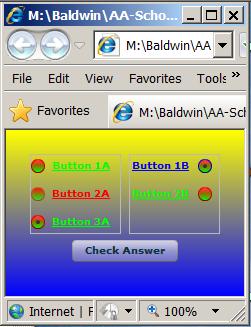
Same application with default styling
By contrast, Figure 2 shows what you would see if no styling had been applied to the radio buttons.
Figure 2. Same application with default styling.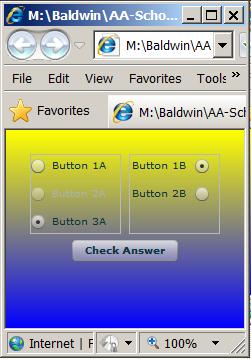
There are two mutually exclusive groups of radio buttons in Figure 1 and Figure 2. As you will see later, buttons are grouped using an element of the RadioButtonGroup class.
A RadioButtonGroup is not a container
Before going any further, I need to make certain that you understand that a RadioButtonGroup element is not a container.
A container (such as a VBox or HBox) implies some sort of physical arrangement of components on the computer screen.
A functional relationship
Assigning a collection of two or more radio buttons to the same RadioButtonGroup creates a functional relationship among the buttons in the group with no implication of a physical arrangement of the radio buttons.
When two or more buttons belong to the same group, they are mutually exclusive from a selection viewpoint. In other words, only one radio button in the group can be selected at any point in time.
A given radio button can belong to only one group.
Put radio buttons in different containers
As is often the case, I placed the radio buttons from each group in Figure 1 in a different VBox container. Then I caused the border of each VBox container to be exposed to provide a visual cue to the user as to which buttons belong to each group.
Could scramble between VBox containers
However, I could have scrambled the radio buttons so that some buttons from each group would appear in each container and they would still behave the same way from a selection viewpoint. I don't recommend that you do that, however, because it would be very confusing to the user.
More images to come later
I hope that you will run this application to get a feel for its behavior. In case you can't, however, I will provide some additional screen shots to illustrate the effects of various styling attributes during the explanation of the XML code.
I will explain this Flex application in fragments. A complete listing of the XML code is provided in Listing 8 near the end of the lesson.
Beginning of the XML code
The XML code for the application begins in Listing 1. In addition to creating the Application container element and setting its background gradient colors, Listing 1 also defines a simple ActionScript element that will be needed later. I will explain the script later when I explain the click event handler that is registered on the Button at the bottom of Figure 1.
Listing 1. Beginning of XML code for
Style02.
<?xml version="1.0" encoding="utf-8"?>

<mx:Application xmlns:mx="http://www.adobe.com/2006/mxml"
    backgroundGradientColors="[#FFFF00,#0000FF]">

    <mx:Script>
        import mx.controls.Alert;
    </mx:Script>
|
The local style element
Listing 2 defines a local style element that applies to all of the RadioButton objects within the Application element.
Listing 2. The local style element.
    <mx:Style>
        RadioButton {{
    	    fillColors: #FF0000, #00FF00, #0000FF,
    	        #FF0000;
    	    fillAlphas:  1,1;
    	    borderColor: #FF0000;
    	    color: #00FF00;
    	    disabledColor:  #FF0000;
    	    textRollOverColor: #FFFF00;
    	    textDecoration:  "underline";
    	    fontWeight: bold;        }
     </mx:Style>
|
Where to learn about available styles for a particular component
Go to the Adobe Flex 3.4 Language Reference (see Resources) and select the class that matches the component name (such as RadioButton) in the lower left frame. Documentation for the component should open in the large frame on the right.
Select the Styles link
Select the Styles link at the top of that frame. That should cause the view to navigate down the page to a section titled Styles.
When you reach that point, you will see a link that reads either:
If you want to see all of the available styles that apply to the component, show the inherited styles. If you want to see only those that are defined for the component, hide the inherited styles.
If you leave the inherited styles open, you will often see a large number of styles in the list that follows. If you hide the inherited styles, the list will typically be shorter.
Some styles may not make any difference
You need to be aware that even though you can apply all of the inherited styles to the component, some of them may have no visual effect. For example, a RadioButton inherits a style named cornerRadius from the Button class. A Button object is rectangular by default. This style is used to cause the corners on a Button to be rounded.
However, a RadioButton is round by default as shown in Figure 1. Therefore, setting the value of this style has no effect on the appearance of a radio button.
Getting more information about a style
Once you have the list of styles exposed, you can click on an individual style to open a page that contains additional information about the style. I will use material from some of those explanations as I explain the behavior of the style values shown in the local style element in Listing 2.
The fillColors style
Let's begin with the style named fillColors in the local style element definition in Figure 2.
This style is inherited from the Button class into the RadioButton class. Here is part of what the documentation has to say about the fillColors style:
Type: Array Format: Color CSS Inheritance: no
Colors used to tint the background of the control. Pass the same color for both values for a flat-looking control. The default value is [ 0xFFFFFF, 0xCCCCCC ].
What does yes and no mean?
The description of each style contains the word yes or no as shown by the yellow highlight above. I have never found the explanation for what this means.
Documentation can be confusing
I invite you to compare the syntax involving the square brackets above with the syntax for the fillColors style values in Listing 2. The square bracket syntax is not used when defining a Style element in XML.
Why four style values?
Another valid question is why I used four style values for fillColors in Listing 2. I learned from the page titled Adobe 3 Flex Style Explorer (see Resources) that if you provide four style values instead of two, the last two apply to a rollover effect for the component.
Red and green
The first two fillColors style values in Listing 2 specify red and green. If you go back to Figure 1, you will see that the radio buttons are red at the top and green at the bottom.
Blue and red
The last two fillColors style values in Listing 2 specify blue and red.
Figure 3 shows the result of pointing to the upper-left radio button with the mouse (even though the mouse pointer is not captured in the screen shot).
Figure 3. Rollover appearance of the radio buttons.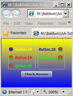
Note that the top of the radio button in Figure 3 is blue and the bottom is red. This corresponds to the last two fillColors values shown in Listing 2.
The textRollOverColor
While we are discussing Figure 3, note that the style named textRollOverColor in Listing 2 has a value that corresponds to yellow. Pointing to the upper-left radio button in Figure 3 not only causes the colors of the radio button proper to change, it also causes the color of the text associated with that button to change to yellow.
An extremely helpful web page
A web page that can be extremely helpful in understanding the behavior of styles as applied to Flex components is the page titled Adobe 3 Flex Style Explorer (see Resources). This is actually a Flex application that allows you to experiment interactively with selected styles applied to selected components. (Note, however that some components, such as RadioButton, are not available on the page as of October 2009.)
Run the explorer
I encourage you to run the explorer and experiment with it while I explain a little about it.
The expplorer displays four panes as shown by the greatly reduced screen shot in Figure 4
Figure 4. Reduced screen shot of Flex Style Explorer.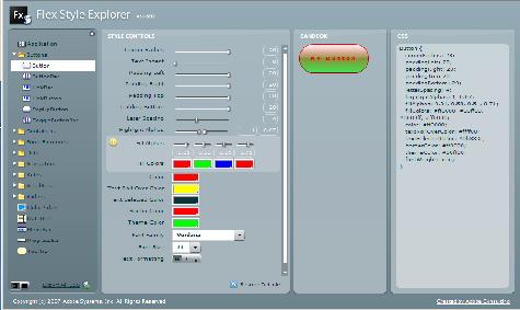
Using the Flex Style Explorer application
You begin by selecting a component in the left pane causing an image of the selected component to appear in the third pane from the left.
Then you use the various input controls in the second pane from the left to set the values for different styles. As you do that, the styles are applied in real time to the image of the component so that you can observe the effect of changes to each style.
You can also manipulate the component with the mouse to see the effects of rollover, click, etc.
CSS text
In addition, the text required for an XML Style element (as in Listing 2) or an external CSS style sheet appears in the rightmost pane in real time. This text changes as you modify the values of the various styles.
Once you have caused the component to take on the appearance and behavior that you want, you can copy the text from the rightmost pane and paste it into your XML Style element or your external CSS style sheet.
Background colors and gradients
You can even set the backgroundColor and backgroundGradientColors of the Flex Style Explorer application to match your application.
However, as near as I can tell, you can't control the vertical position of the component in the explorer. Therefore, if you use a background gradient and your component has any alpha values less than 1.0, you will need to consider the impact of the background color gradient on your component color at the position of the component.
While the explorer application may not be perfect, it is extremely useful.
The fillAlphas style
Returning to the discussion of the Style element in Listing 2, the fillAlphas style, which is inherited from the Button class, has a default value of [0.6,0.4]. Listing 2 sets this to [1,1] to prevent the gradient background colors from showing through the radio buttons.
The borderColor style
Listing 2 sets the borderColor style to red. This causes four of the five radio buttons in Figure 1 to have a red border. As you will see later, an inline style definition is used to cause one of the buttons to have a blue borderColor.
The color style
The color style, which is also inherited from the Button class, controls the color of the text associated with the radio button. This is set to green in Listing 2, causing the text for three of the five buttons in Figure 1 to be green. (I will explain the red and blue text in Figure 1 later.)
The default value for the color style is #0B333C. This is the color of the radio button text that you see in Figure 2. It is also the color of the text on the large Button in Figure 1 and Figure 2.
As you will see later, the enabled property for the middle radio button in the leftmost group is set to false. The disabledColor style in Listing 2 controls the text color for disabled radio buttons. Therefore, the disabled radio button in Figure 1 has red text.
The textDecoration style
This style has two possible values, "none" and "underline". The default is "none". Listing 2 sets the value for this style to "underline" causing the text associated with the radio buttons in Figure 1 to be underlined.
The fontWeight style
This style has two values: normal and bold (note the absence of quotation marks). Setting this style to bold in Listing 2 causes the text in Figure 1 to be boldface.
That completes the discussion of the local Style element in Listing 2.
Define two radio button groups
Listing 3 defines the two radio button groups discussed earlier.
Listing 3. Define two radio button groups.
    <mx:RadioButtonGroup id="radioGroupA"/>

    <mx:RadioButtonGroup id="radioGroupB"
        labelPlacement="left"/>
|
These two groups will be referred to by their id values later to assign individual radio buttons to one group or the other.
The labelPlacement property
The attribute (property) value named labelPlacement is set to "left" for the second group in Listing 3. This causes the labels on the two buttons in the rightmost group in Figure 1 to be to the left of the radio button. The labels on the three buttons in the leftmost group are to the right of the button, which is the default.
Allowable values for the labelPlacement style are "right", "left", "bottom", and "top". The default is "right".
The overall containment structure
The overall structure that you see in Figure 1 consists of an HBox container and a Button contained in the Application container.
As you can see in Listing 1, no layout property was specified for the Application container. This causes the default vertical layout for the Application container to be in effect. This, in turn causes the HBox and the Button to be vertically aligned and centered in the browser window with the Button below the HBox. (There is no visual manifestation for the HBox in Figure 1. It is totally transparent by default.)
A pair of VBox containers
The HBox contains a pair of VBox containers positioned horizontally within the HBox. Although the VBox containers are transparent, their borders are exposed as shown in Figure 1.
Placement of the radio buttons
The three radio buttons that belong to radioGroupA are contained in the leftmost VBox in Figure 1. The two radio buttons that belong to radioGroupB are contained in the rightmost VBox in Figure 1. In each case, the radio buttons are aligned vertically in their respective VBox.
The top-left radio button
Listing 4 shows the following:
Listing 4. The first radio button.
    <mx:HBox width="100%">
        <mx:VBox width="50%" height="100%"
            borderStyle="solid">

            <mx:RadioButton label="Button 1A"
                groupName="radioGroupA"
                id="id1A"/>
|
The borderStyle style
One of the available styles for a VBox is named borderStyle. Listing 4 uses an inline style definition to set the value for this style to "solid". This causes the outline of the VBox to be visible in Figure 1.
Other possible values for this style are "none", "inset", and "outset". The latter two styles create a 3D effect through the use of highlights and shadows.
The RadioButton element
The last element in Listing 4 creates the upper-left radio button shown in Figure 1 and assigns it to the button group identified in Listing 3 as radioGroupA.
The radio button is also given the label shown in Figure 1 and is given an id that can be used to refer back to the button later if needed.
Two more radio buttons in the leftmost VBox
Listing 5 creates the two remaining radio buttons shown in the leftmost VBox in Figure 1.
Listing 5. Two more radio buttons in the
leftmost VBox.
            <mx:RadioButton label="Button 2A"
                groupName="radioGroupA"
                id="id2A"
                enabled="false"/>

            <mx:RadioButton label="Button 3A"
                groupName="radioGroupA"
                id="id3A"
                selected="true"/>

        </mx:VBox>
|
The enabled property for the first RadioButton element in Listing 5 is set to false. This causes the left-center radio button in Figure 1 to be disabled, meaning that it is incapable of accepting user interaction.
This, in turn, causes the color of the text for that button to be red in accordance with the value assigned to the disabledColor style in Listing 2.
A selected radio button
The selected property for the second RadioButton element in Listing 5 is set to true. This causes the button to be toggled to the on state at startup. Visually, this causes the black dot to appear in the center of the bottom left radio button in Figure 1.
Selection by the user
Once the application is running, the user can select either the top or the bottom radio button in the leftmost VBox in Figure 1 by clicking the button with the mouse. The center radio button in the leftmost VBox can't be selected because it is disabled.
The end of the leftmost VBox
Listing 5 also contains the end tag for the leftmost VBox element that began in Listing 4.
The rightmost VBox with two radio buttons
Listing 6 shows the XML code for the rightmost VBox element shown in Figure 1 along with the two RadioButton elements contained in that VBox.
Listing 6. The rightmost VBox with two
radio buttons.
        <mx:VBox width="50%" height="100%"
            borderStyle="solid">

            <mx:RadioButton label="Button 1B"
                groupName="radioGroupB"
                borderColor="#0000FF"
                color="#0000FF"
                id="id1B"
                selected="true"/>

            <mx:RadioButton label="Button 2B"
                groupName="radioGroupB"
                id="id2B"/>

        </mx:VBox>

    </mx:HBox>
|
Override the local style values
Listing 6 uses inline style definitions to override the local style values for borderColor and color that were established in Listing 2. As a result, the upper-right radio button in Figure 1 has a blue border with a blue text color.
The end of the HBox element
Listing 6 also contains the end tag for the HBox element that began in Listing 4.
Servicing the radio buttons with a Button
The purpose of using radio buttons is normally to allow a user to select one of two or more options. Listing 7 creates the large button shown below the HBox in Figure 1.
Listing 7. Servicing the radio buttons
with a Button.
  <mx:Button label="Check Answer"
    click="Alert.show((id2B.selected || id3A.selected))?
     'Correct!':'Wrong - 3A or 2B is correct',
     'Result')"/>
</mx:Application>
|
Define a click event handler
Listing 7 also defines a click event handler for the button that queries the state of the radio buttons and displays an Alert dialog box containing the result of the query. Before getting into the explanation, I will show you the results of clicking the button.
Result when either radio button 3A or 2B is selected
Figure 5 shows the result of clicking the large button when either radio button 3A or radio button 2B (or both) is selected.
Figure 5. Result when either radio button 3A or 2B is selected.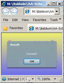
Result when neither radio button 3A nor 2B is selected
Figure 6 shows the result of clicking the large button when neither radio button 3A nor radio button 2B is selected.
Figure 6. Result when neither radio button 3A nor 2B is selected.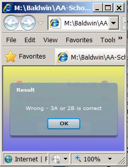
The Alert class
Figure 5 and Figure 6 both show an Alert control. Here is part of what the documentation has to say about the Alert class:
The Alert control is a pop-up dialog box that can contain a message, a title, buttons (any combination of OK, Cancel, Yes, and No) and an icon. The Alert control is modal, which means it will retain focus until the user closes it.Import the mx.controls.Alert class into your application, and then call the static show() method in ActionScript to display an Alert control. You cannot create an Alert control in MXML.
The Alert control closes when you select a button in the control, or press the Escape key.
A simple XML Script element
I explained earlier that Listing 1 defines a simple ActionScript element that would be needed later. I promised to explain that element while explaining the click event handler that is registered on the Button at the bottom of Figure 1 by the code in Listing 7.
The ActionScript element in Listing 1 satisfies the import requirement shown above with a yellow highlight.
The click event handler
Now I will attempt to explain the XML code in Listing 7. The text that is highlighted in yellow, lime, and fuchsia in Listing 7 is sort of like an if statement.
If the conditional expression highlighted in yellow is true, then the text highlighted in lime is displayed in the Alert box as shown in Figure 5. Otherwise, the text highlighted in fuchsia is displayed in the Alert box as shown in Figure 6.
The conditional expression
Getting back to the conditional expression, the "||" is a logical "inclusive or" operator. The conditional expression will be true:
This will result in the output shown in Figure 5.
A false result
The conditional expression will be false if neither the radio button with the id value of id2B nor the radio button with the id value of id3A is selected.
This will result in the output shown in Figure 6.
Physical locations of the two radio buttons
The radio button with the id value of id2B was created in Listing 6, and is the bottom-right radio button in Figure 1. The radio button with the id value of id3A was created in Listing 5 and is the bottom-left radio button in Figure 1.
The end of the application element
Listing 7 contains the closing tag for the Application element.
I encourage you run the online version of this program. Then copy the code from Listing 8. Use that code to create a Flex project. Compile and run the project. Experiment with the code, making changes, and observing the results of your changes. Make certain that you can explain why your changes behave as they do.
In this lesson, you have learned how to use both local style definitions and inline style definitions.
You learned how to use the Flex 3 Style Explorer to apply styles to components on an interactive experimental basis.
You learned how to group radio buttons into mutually exclusive groups and how to query radio buttons to determine which buttons have been selected.
You learned how to write a click event handler that activates a pop-up dialog box based on the Alert class.
Listing 8. XML code for Style02.
<?xml version="1.0" encoding="utf-8"?>

<!--
Style02.mxml
Illustrates the use of a local style definition and the
overriding of selected elements in the local style
definition with inline style definitions.

The main purpose of the application is to illustrate
styling.  However, it also illustrates how to group radio
buttons.

It also illustrates the handling of a click event on a
button to determine if either of two specific RadioButtons
are selected.  This requires the use of a simple
ActionScript element to import an Alert control.
-->

<mx:Application xmlns:mx="http://www.adobe.com/2006/mxml"
    backgroundGradientColors="[#FFFF00,#0000FF]">

    <mx:Script>
        import mx.controls.Alert;
    </mx:Script>

    <mx:Style>
        RadioButton {
    	    fillColors: #FF0000, #00FF00, #0000FF,
    	        #FF0000;
    	    fillAlphas:  1,1;
    	    borderColor: #FF0000;
    	    color: #00FF00;
    	    disabledColor:  #FF0000;
    	    textRollOverColor: #FFFF00;
    	    textDecoration:  "underline";
    	    fontWeight: bold;
        }
    </mx:Style>

    <mx:RadioButtonGroup id="radioGroupA"/>
    <mx:RadioButtonGroup id="radioGroupB"
        labelPlacement="left"/>

    <mx:HBox width="100%">
        <mx:VBox width="50%" height="100%"
            borderStyle="solid">

            <mx:RadioButton label="Button 1A"
                groupName="radioGroupA"
                id="id1A"/>
            <mx:RadioButton label="Button 2A"
                groupName="radioGroupA"
                id="id2A"
                enabled="false"/>
            <mx:RadioButton label="Button 3A"
                groupName="radioGroupA"
                id="id3A"
                selected="true"/>
        </mx:VBox>

        <mx:VBox width="50%" height="100%"
            borderStyle="solid">

            <mx:RadioButton label="Button 1B"
                groupName="radioGroupB"
                borderColor="#0000FF"
                color="#0000FF"
                id="id1B"
                selected="true"/>
            <mx:RadioButton label="Button 2B"
                groupName="radioGroupB"
                id="id2B"/>
        </mx:VBox>
    </mx:HBox>

    <mx:Button label="Check Answer"
        click="Alert.show((id2B.selected || id3A.selected)?
           'Correct!':'Wrong - 3A or 2B is correct',
           'Result')"/>
           </mx:Application>
|
Copyright 2009, Richard G. Baldwin. Reproduction in whole or in part in any form or medium without express written permission from Richard Baldwin is prohibited.
Richard has participated in numerous consulting projects and he frequently provides onsite training at the high-tech companies located in and around Austin, Texas. He is the author of Baldwin's Programming Tutorials, which have gained a worldwide following among experienced and aspiring programmers. He has also published articles in JavaPro magazine.
In addition to his programming expertise, Richard has many years of practical experience in Digital Signal Processing (DSP). His first job after he earned his Bachelor's degree was doing DSP in the Seismic Research Department of Texas Instruments. (TI is still a world leader in DSP.) In the following years, he applied his programming and DSP expertise to other interesting areas including sonar and underwater acoustics.
Richard holds an MSEE degree from Southern Methodist University and has many years of experience in the application of computer technology to real-world problems.
-end-