
|
|
Published: October 28, 2009
Updated: December 14, 2009
Validated with Amaya
by Richard G. Baldwin
Flex Programming Notes # Flex0116
This tutorial lesson is part of a continuing series dedicated to programming with Adobe Flex.
An earlier lesson titled The Default Application Container provided information on how to get started programming with Adobe's Flex Builder 3. (See Baldwin's Flex programming website.)
What you will learn
In this lesson, you will learn how to define and use custom MXML components.
I recommend that you open another copy of this document in a separate browser window and use the following links to easily find and view the figures and listings while you are reading about them.
I recommend that you also study the other lessons in my extensive collection of online programming tutorials. You will find a consolidated index at www.DickBaldwin.com.
What is a custom MXML component?
According to Defining custom MXML components,
"Custom MXML components are MXML files that you create and use as custom MXML tags in other MXML files. They encapsulate and extend the functionality of existing Flex components. Just like MXML application files, MXML component files can contain a mix of MXML tags and ActionScript code. The name of the MXML file becomes the class name with which you refer to the component in another MXML file."
Project file structure
In this lesson, I will present and explain a Flex project named CustomComps02. Figure 1 shows a screen shot of the project file structure that was captured from the Flex Builder 3 IDE.
Figure 1. Project file structure for CustomComps02.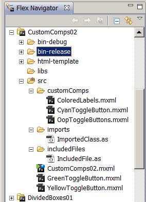
This is a relatively complex project involving eight different MXML and ActionScript files. The application file is named CustomComps02.mxml.
Running the flex application named CustomComps02
I encourage you to run the online version of this program before continuing with this lesson.
Program output at startup
Figure 2 shows the program output at startup.
Figure 2. Program output at startup.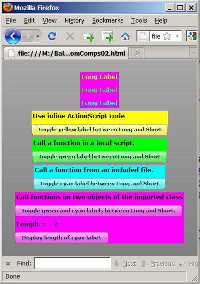
Five custom MXML components
This application defines five custom MXML components. Each component is housed in a Flex VBox object, and each VBox object is given a background color so that the components can be visually separated in Figure 2.
The top component with the magenta background consists of three Flex Label objects with different colored text. (Some people refer to magenta, #FF00FF, as fuchsia.)
The remaining four custom components consist of various combinations of Button objects, Label objects, and ActionScript code.
Program output after clicking some buttons
Four of the five buttons toggle the text in the top component between "Long Label" and "Short" as shown in Figure 2.
Figure 3. Program output after clicking buttons.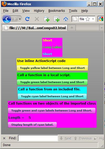
The bottom button causes the current length of the text in the cyan label in the top component to be displayed immediately above the button.
Does this sound familiar?
If this sounds familiar to you, it should. This project is an update of a project that I presented and explained in an earlier lesson titled Integrating ActionScript and Flex. In this lesson, I will separate the major sections of MXML code from that application into custom MXML components. Your familiarity with the original project should make it easier for you to understand the current project.
As shown in Figure 1, this Flex application consists of the following files:
I will explain the code in these files in fragments. Complete listings of all the files are provided in Listing 21 through Listing 28 near the end of the lesson.
Beginning of the file named CustomComps02.mxml
The main application file begins in Listing 1.
Listing 1. Beginning of the file named
CustomComps02.mxml.
<?xml version="1.0"?>
<!--
CutomComps02
Illustrates the definition and use of custom MXML
components, both in the src directory and in a sub-
directory of src.
-->
<mx:Application
    xmlns:mx="http://www.adobe.com/2006/mxml"
    xmlns:MyComps="customComps.*"
    xmlns:SrcFldr="*"
    backgroundColor="#999999"
    creationComplete="initApp();">
|
New namespaces
The code that is highlighted in yellow is new to this lesson. This code establishes two new namespaces that can be used later to refer to the custom component files.
The namespace named MyComps designates a child folder of the folder named src. The child folder is named customComps as shown in Figure 1.
The namespace named SrcFldr designates the folder named src.
What about the asterisk?
In both cases, the asterisk indicates that any custom component file that resides in the specified folder belongs to the specified namespace. Referring back to Figure 1, there are three custom components in the MyComps namespace and two custom components in the SrcFldr namespace.
Instantiate five custom component objects
Listing 2 uses standard MXML code to instantiate five custom components and arrange them vertically in the Application object as shown in Figure 2. (I will refer back to the highlighting colors later in this lesson.)
Listing 2. Instantiate five custom component objects. <MyComps:ColoredLabels id="coloredLabels"/> <SrcFldr:YellowToggleButton id="yellowToggleButton"/> <SrcFldr:GreenToggleButton id="greenToggleButton"/> <MyComps:CyanToggleButton id="cyanToggleButton"/> <MyComps:OopToggleButtons id="oopToggleButtons"/> |
As you will see later, each custom component is built using a VBox container and each container is given a background color to make the five custom components easy to identify in Figure 2.
Note the use of the custom namespaces in Listing 2 in place of the typical mx namespace.
Set property values in four custom components
The ActionScript code in Listing 3 sets property values in four of the custom components.
Listing 3. Set property values in four custom components. <mx:Script> <![CDATA[ private function initApp():void{ yellowToggleButton.theYellowLabel =coloredLabels.yellowLabel; greenToggleButton.theGreenLabel =coloredLabels.greenLabel; cyanToggleButton.theCyanLabel =coloredLabels.cyanLabel; oopToggleButtons.theGreenLabel =coloredLabels.greenLabel; oopToggleButtons.theCyanLabel =coloredLabels.cyanLabel; }//end initApp ]]> </mx:Script> </mx:Application> |
The property values are set to values that reference the three labels in the top custom component shown in Figure 2.
Behavior of the application
When the top four buttons in these four custom components (see Figure 3) are clicked, click event handlers registered on those buttons cause the text to change in a corresponding label in the top custom component.
When the bottom button in Figure 3 is clicked, a click event handler registered on that button causes the current length of the cyan-colored label at the top to be displayed immediately above the bottom button.
I will begin my explanation of custom components with the simplest one of the bunch named ColoredLabels. This is the component with three colored labels on a magenta background shown at the top of Figure 2. This is also the custom component that is instantiated by the code with the magenta highlight at the top of Listing 2.
This code for this custom component is shown in its entirety in Listing 4. (A reference copy is also provided in Listing 26.)
Listing 4. The custom component named
ColoredLabels.
<?xml version="1.0" encoding="utf-8"?>

<mx:VBox xmlns:mx="http://www.adobe.com/2006/mxml"
    backgroundColor="#FF00FF">

    <mx:Label id="yellowLabel" text="Long Label"
        color="#FFFF00" fontSize="12" fontWeight="bold"/>
    <mx:Label id="greenLabel" text="Long Label"
        color="#00FF00" fontSize="12" fontWeight="bold"/>
    <mx:Label id="cyanLabel" text="Long Label"
        color="#00FFFF" fontSize="12" fontWeight="bold"/>

</mx:VBox>
|
You must provide your own container
Note first that when you define an MXML custom component, there is no default Application container as shown in Listing 1. Therefore, you must provide your own container to hold the other components that you intend to include in your custom component. In this case, I elected to use a VBox container, but there are other containers that I could have used as well.
No ActionScript code in this custom component
There is no ActionScript code in Listing 4, which is why I said it is the simplest of the custom components that I will define in this lesson. Listing 4 consists simply of four XML elements, each of which instantiates a Label object and sets some attributes (properties) of the object including the color of the text.
The id attribute is a reference
Of particular importance is the id attribute of each Label object, which provides the reference by which other code in the application can gain access to the object.
Three labels with colored text
As you can see from Listing 4 and Figure 2, this custom component contains three labels with colored text. The initial text property of each label is set in Listing 4 and shown in Figure 2. The values of the text properties of the labels will be modified by click event handlers on buttons in other custom components that hold references to these labels. The results of clicking some of those buttons are shown in Figure 3.
A member of the MyComps namespace
Note in Figure 1 that this custom component is in a sub-directory of the
src directory causing it to be in the MyComps namespace as shown
in Listing 2.
The custom component named YellowToggleButton, (which resides in the SrcFldr namespace), begins in Listing 5. This is the component with a label and a button on a yellow background shown in Figure 2. This is also the custom component that is instantiated by the code with the yellow highlight in Listing 2.
Listing 5. Beginning of the custom
component named YellowToggleButton.
<?xml version="1.0" encoding="utf-8"?>

<mx:VBox xmlns:mx="http://www.adobe.com/2006/mxml"
    backgroundColor="#FFFF00">

    <mx:Script><![CDATA[
        import mx.controls.Label;
        private var yellowLabel:Label;

        //Implicit setter
        public function set theYellowLabel(
	                               label:Label):void{
            yellowLabel = label;
        }//end implicit setter
    ]]></mx:Script>
|
Constructed in a VBox container
You will note in Listing 5 that this custom component is constructed in a VBox container with a yellow background.
Behavior
This custom component, (which consists of a box, a button, a label, and some ActionScript code), is designed to hold a reference to a Label object that is encapsulated in a different custom component. When the button in this component is clicked, an event handler on the button modifies the text in the label.
A property named theYellowLabel
Quite a bit of what you see in Listing 5 is new to this lesson. To begin with, the custom component contains a private instance variable of type Label named yellowLabel (highlighted in cyan in Listing 5). This variable is the storage location for a property of the custom component. The property is named theYellowLabel.
Go back and look at Listing 3
The yellow highlighted code in Listing 3 assigns a Label object's reference to the property named theYellowLabel belonging to an object of this custom component class. This is possible because this custom component contains an implicit setter function, which is highlighted in yellow in Listing 5.
What is a setter?
To understand setters (and getters) you must first understand the concept of information hiding. The concept of information hiding tells us that most, if not all of the properties of an object should be stored in private variables (or private data structures) that are guarded by public setter and getter functions.
A read only property
For example, some properties (such as the length property of the String class) are read-only properties. If the value or values that represent a read-only property are stored in a public variable or data structure, there is nothing to prevent code outside the object from modifying the value. (Then it wouldn't be read-only.) To guard against that, the value or values should be stored in a private variable or data structure and a public getter function should be provided to allow read-only access to the value.
Protecting against unreasonable values
As another example, assume that you have an object of type Person that has a property named age. The object is intended to represent a real person, and the value of the property is intended to represent the numeric age of the person represented by the object.
Appropriate and inappropriate age values
It would probably be inappropriate for a negative value, or a value greater than about 110 to be stored in the age property. However, if the age property is represented in the object by a public variable, there would be nothing to prevent code outside the object from assigning inappropriate values to the property.
A filter
This is a case where a public setter could be written to filter out inappropriate values. If the setter is called with an appropriate value for the person's age, it will simply store the value in the private variable being used to store the property's value. On the other hand, the setter can take some specific action, (such as throwing an exception), if it is called with an inappropriate value.
What is an implicit setter?
An implicit setter is a special form of function that allows the using code to store values in the property using an assignment operator instead of making a function call.
Note the existence of the word set in the definition of the implicit setter function in Listing 5. This word does not appear in a normal function definition. This special syntax makes it possible for the using code to assign a value directory to the setter name (theYellowLabel) as shown in Listing 3 instead of making a call to a function namedtheYellowLabel, which would be required for an ordinary (explicit) setter function.
The name of the property
The name of the property is the name of the implicit setter function (theYellowLabel in this case) and is not the name of the variable in which the value is stored (yellowLabel in this case).
What is an implicit getter?
An implicit getter is essentially the reverse of an implicit setter in which the word get is used to make the function behave as an implicit getter. You will see some examples of an implicit getter later in this lesson.
Finish constructing the custom component
Listing 6 instantiates the Label object and the Button object that together with some ActionScript code and a VBox container constitute the custom component shown with the yellow background in Figure 2.
Listing 6. An inline ActionScript click
event handler.
    <mx:Label text="Use inline ActionScript code"
        color="#000000"
        fontSize="12" fontWeight="bold"/>

    <mx:Button
        label=
            "Toggle yellow label between Long and Short"
        click="
        if(yellowLabel.text=='Long Label'){
            yellowLabel.text='Short';
        }else{
            yellowLabel.text='Long Label';
        }//end else
        "/>

</mx:VBox>
|
An inline ActionScript click event handler
Listing 6 also defines an inline ActionScript click event handler and registers it on the button.
Note that the code in the event handler operates on the value that represent's the object's property named theYellowLabel. In other words, the code acts on the variable named yellowLabel that stores the property value and does not act on the name of the property, (which is the name of the implicit setter function shown in Listing 5).
Indirection
The variable named yellowLabel contains a reference to the yellow label shown at the top of Figure 2. Therefore, operations performed on the reference manifest themselves visually on the yellow label in Figure 2. This is called indirection.
Similar to a previous lesson
The code in the event handler is essentially the same as code that I explained in an earlier lesson except that in this case, the code is contained in a custom MXML component.
Visual representation of the custom component
The entire custom component is represented by the box, the label and the button with the yellow background in Figure 2. Clicking the yellow button causes the text in the yellow label at the top to toggle between the two values defined in Listing 6.
Caution - inline ActionScript code can be tricky
My experience is that inline ActionScript code can be very tricky from a syntax viewpoint. You may find that your inline ActionScript code doesn't behave exactly as you thought it would even though no compiler or runtime errors are reported. Therefore, I recommend that inline code be used for only the simplest operations. Beyond that, I recommend that you write the code in an ActionScript function and call the function from the MXML attribute as illustrated in Listing 8.
The custom component named GreenToggleButton, (which resides in the SrcFldr namespace), begins in Listing 7. This is the custom component with a label and a button on a green background shown in Figure 2. This is also the custom component that is instantiated by the code with the green highlight in Listing 2. (Note that some people refer to the color green, #00FF00, as lime.)
Listing 7. Beginning of the custom
component named GreenToggleButton.
<?xml version="1.0" encoding="utf-8"?>

<mx:VBox xmlns:mx="http://www.adobe.com/2006/mxml"
    backgroundColor="#00FF00">

    <mx:Script><![CDATA[
        import mx.controls.Label;
        private var greenLabel:Label;

        //Implicit setter
        public function set theGreenLabel(
                                        label:Label):void{
            greenLabel = label;
        }//end implicit setter
    ]]></mx:Script>
|
Very similar to the YellowToggleButton
A comparison of Listing 7 with Listing 5 reveals that up to this point, the two custom components are essentially the same. Both use an implicit setter to make it possible for the code in Listing 3 to use an assignment operator to cause a Label object's reference to be stored in a private instance variable belonging to the custom component object. (See the code with the green highlight in Listing 3.)
The difference between the two custom components derives from the methodology used to manipulate the text in the Label object whose reference is stored in the private instance variable.
Complete the construction of the GreenToggleButton component
Once again, this custom component is constructed using a VBox container as shown in Listing 7. Listing 8 adds a label and a button along with some ActionScript code to the VBox to complete the construction of the custom component.
Listing 8. Complete the construction of
the GreenToggleButton component.
<!--Define a function in a local script.--> <mx:Script><![CDATA[ //ActionScript code in a local script. private function toggleGreenLabel():void{ if(greenLabel.text=="Long Label") { greenLabel.text = "Short"; }else{ greenLabel.text = "Long Label"; }//end else }//end function toggleGreenLabel ]]></mx:Script> <!--Call the function in the local script.--> <mx:Label text="Call a function in a local script." color="#000000" fontSize="12" fontWeight="bold"/> <mx:Button label="Toggle green label between Long and Short" click="toggleGreenLabel()"/> </mx:VBox> |
Register a click event handler
Listing 8 also registers a click event handler on the button by calling the function named toggleGreenLabel that is defined in an MXML Script element. In my opinion, this is a better way to package the ActionScript code than to use the inline ActionScript code shown in Listing 6.
This is the same methodology that I explained in an earlier lesson, so an explanation should not be needed in this lesson. The difference is that the methodology is applied to a custom MXML component in this lesson.
The custom component named CyanToggleButton, (which resides in the MyComps namespace), begins in Listing 9. This is the custom component with a label and a button on a cyan background shown in Figure 2. This is also the custom component that is instantiated by the code with the cyan highlight in Listing 2. (Some people refer to cyan, #00FFFF, as aqua.)
Listing 9. Beginning of the custom
component named CyanToggleButton.
<?xml version="1.0" encoding="utf-8"?>

<mx:VBox xmlns:mx="http://www.adobe.com/2006/mxml"
    backgroundColor="#00FFFF">

    <mx:Script><![CDATA[
        import mx.controls.Label;
        private var cyanLabel:Label;

        //Implicit setter
        public function set theCyanLabel(
                                        label:Label):void{
            cyanLabel = label;
        }//end implicit setter
    ]]></mx:Script>
|
Very similar to the YellowToggleButton and GreenToggleButton
A comparison of Listing 9 with Listing 7 and Listing 5 reveals that up to this point, all three custom components are essentially the same. All three use an implicit setter to make it possible for the code in Listing 3 to use an assignment operator to cause a Label object's reference to be stored in a private instance variable belonging to the custom component object. (See the code with the cyan highlight in Listing 3.)
The difference between the three custom components derives from the methodology they use to manipulate the text in the Label object whose reference is stored in the private instance variable.
Complete the construction of the CyanToggleButton component
As before, this custom component is constructed using a VBox container as shown in Listing 9. Listing 10 adds a label and a button along with some ActionScript code to the VBox to complete the construction of the custom component.
Listing 10. Complete the construction of
the CyanToggleButton component.
   <!--Include a file in a local script.-->
    <mx:Script><![CDATA[
        //ActionScript code to include an external
        // file. Note the use of ..
        include "../includedFiles/IncludedFile.as";
    ]]></mx:Script>


    <!--Call a function from the included file.-->
    <mx:Label
        text="Call a function from an included file."
        color="#000000"
        fontSize="12" fontWeight="bold"/>

    <mx:Button
        label="Toggle cyan label between Long and Short"
        click="toggleCyanLabel()"/>

</mx:VBox>
|
Register a click event handler
Listing 10 also registers a click event handler on the button by calling the function named toggleCyanLabel. In this case, however, the function is not defined in the MXML Script element. Instead, the function is defined in the ActionScript file named IncludedFile.as (see Listing 27), which in turn is included in the mx:Script element in Listing 10.
This is the same methodology that I explained in an earlier lesson, so an explanation should not be needed in this lesson. The difference is that the methodology is applied to a custom MXML component in this lesson.
Note the ../ in the path to the included file
If you refer back to Figure 1, you will see that the files named CyanToggleButton.mxml and IncludedFile.as are each contained in folders that are children of the folder named src. As a result, the path to the included file in Listing 10 begins with "../" (two periods and a forward slash), which means back up one level before navigating to the included file.
As was the case in the earlier lesson, you will need some knowledge of object-oriented programming for the remainder of this lesson to make sense. However, you are welcome to continue even if you don't have that knowledge. Or, you can study object-oriented programming and return to this section later if you prefer.
The custom component named OopToggleButtons, (which resides in the MyComps namespace), begins in Listing 11. This is the custom component with three labels and two buttons on a magenta background at the bottom of Figure 2. This is also the custom component that is instantiated by the code with the magenta highlight at the bottom of Listing 2.
Listing 11. Beginning of the custom
component named OopToggleButtons.
<?xml version="1.0" encoding="utf-8"?>;

<mx:VBox xmlns:mx="http://www.adobe.com/2006/mxml"
    backgroundColor="#FF00FF"
    creationComplete="initApp();">

    <mx:Script><![CDATA[
        import mx.controls.Label;
        private var greenLabel:Label;
        private var cyanLabel:Label;

        //Implicit setter
        public function set theGreenLabel(
                                        label:Label):void{
            greenLabel = label;
        }//end implicit setter

        //Implicit setter
        public function set theCyanLabel(
                                        label:Label):void{
            cyanLabel = label;
        }//end implicit setter
    ]]></mx:Script>
|
Similar to other toggle buttons
A comparison of Listing 11 with Listing 9 reveals that up to this point, this custom component is similar to the other three custom components. All three use implicit setters to make it possible for the code in Listing 3 to use assignment operators to cause Label object's references to be stored in private instance variables belonging to the custom component objects. (See the code with the magenta highlight in Listing 3.)
Two implicit setters
The difference between this custom component and the other three custom components so far is that this custom component has two different implicit setters that define properties named theGreenLabel and theCyanLabel. (References to two different Label objects are assigned to the two properties by the magenta code at the bottom of Listing 3.)
Label manipulation methodology
As before, the real difference between all four custom components derives from the methodology they use to manipulate the text in the Label objects whose references are stored in the private instance variables belonging to the custom component objects.
This is a custom component that is designed to instantiate objects from an imported class and to call methods belonging to the object to manipulate the text in Label objects belonging to a different custom component.
Import a custom class
Listing 12 imports a custom class and instantiates two objects from the imported class.
Listing 12. Import a custom class and
instantiate two objects from the imported class.
    <mx:Script><![CDATA[
        import imports.ImportedClass;
        private var greenObj:ImportedClass = null;
        private var cyanObj:ImportedClass = null;

        private function initApp():void {
            greenObj = new ImportedClass(greenLabel);
            cyanObj = new ImportedClass(cyanLabel);
        }//end initApp
    ]]></mx:Script>
|
Houston, we have a problem
The code in Listing 12 is very similar to code that I explained in an earlier lesson. Even though that code worked as intended in the earlier application, it doesn't always work as intended in this application.
A timing problem
As a result of the additional levels of indirection in this application, it is possible that the references named greenLabel and cyanLabel that are declared in Listing 11 will still be null when these objects are instantiated. This is true despite the fact that the function named initApp that instantiates the new objects is not executed until the creationComplete event is fired in Listing 11. (You learned about the creationComplete event in an earlier lesson.)
As a result, the new objects may not contain references to the labels as intended. The may contain null instead. I will explain some code that I wrote to guard against the harmful effects of this possibility.
Different background colors
In order to understand how this works, it is necessary to consider the imported class and the custom component in parallel. Therefore, the remaining listings will be taken from both the custom component and the imported class. Listing from the custom component will be identified by this background color. Listings from the imported class will be identified by this background color.
Beginning of the imported class
The imported class begins in Listing 13.
Listing 13. Beginning of the imported
class.
package imports{
    import mx.controls.Label;

    public class ImportedClass extends Object{
        private var label:Label = null;//instance var
        //============================================//

        //This is a constructor
        public function ImportedClass(myLabel:Label){
            label=myLabel;
        }//end constructor
|
This class definition is stored in the file named src/imports/ImportedClass.as (see Figure 1).
Instantiate objects of this class
As you saw earlier, the custom component named OopToggleButtons instantiates objects of this class and populates them with references to Label objects. Then the function named toggleLabel is called on the objects to manipulate the text belonging to the Label objects. The function named getLength is called on one of the objects to display the length of the text in the corresponding Label object.
The constructor
Listing 13 contains a private reference variable named label that is used to store a reference to a Label object. Listing 13 also shows the constructor that is called twice in Listing 12 to instantiate two objects of this class in an attempt to store Label object's references in the variable named label in each object.
A click event handler on the top button
Listing 14 constructs the label and button at the top of the custom component with the magenta background at the bottom of Figure 2.
Listing 14. A click event handler on the
top button.
    <mx:Label
        text=
"Call functions on two objects of the imported class"
        color="#000000"
        fontSize="12" fontWeight="bold"/>

    <mx:Button
        label=
"Toggle green and cyan labels between Long and Short."
        click="toggleTwoLabels();
        "/>
|
Listing 14 also registers a click event handler on the button by calling a local ActionScript function named toggleTwoLabels.
The toggleTwoLabels function
The toggleTwoLabels function is shown in its entirety in the Script element in Listing 15.
Listing 15. The toggleTwoLabels function.
    <mx:Script><![CDATA[
       //This function is called by a click event handler
       // later.
       //Note that this code uses implicit getters and
       // setters.
       private function toggleTwoLabels():void{
            //Make certain that the object is populated
            // before trying to access its members for
            // the first time.
            if(greenObj.theLabel==null){
                greenObj.theLabel=greenLabel;
            }//end if
            greenObj.toggleLabel();

            if(cyanObj.theLabel==null){
                cyanObj.theLabel=cyanLabel;
            }//end if
            cyanObj.toggleLabel();
        }//end toggleTwoLabels
    ]]></mx:Script>;
|
Two chunks of code
The code with the green highlight in Listing 15 calls the toggleLabel function on one of the objects instantiated in Listing 12 to cause the green text at the top of Figure 3 to toggle between "Long Label" and "Short".
The code with the cyan highlight in Listing 15 calls the toggleLabel function on the other object instantiated in Listing 12 to cause the cyan text at the top of Figure 3 to toggle between "Long Label" and "Short".
Guard against a runtime error
In both cases, however, the code in Listing 15 uses an if statement to determine if the reference stored in the object is null. If so, the correct reference is stored in the object before calling the toggleLabel function. This requires the ability to get and set the value of the reference in the object. That capability is provided by the implicit getter and implicit setter functions belonging to the class named ImportedClass shown in Listing 16.
Listing 16. Implicit getter and setter
functions in ImportedClass.
        //This is an implicit getter.
        public function get theLabel():Label{
            return label;
        }//end implicit getter for label
        //============================================//

        //This is an implicit setter.
        public function set theLabel(myLabel:Label):void{
            label = myLabel;
        }//end implicit setter for label
|
You should understand this code
Knowing what you already know about implicit setter functions, the setter code in Listing 16 should not require an explanation. Also knowing what you already know about implicit setter functions, the implicit getter function in Listing 16 should not be difficult for you to understand. Note that the getter contains the word get and the setter contains the work set.
The toggleLabel function in ImportedClass
After becoming satisfied that the objects of type ImportedClass don't contain null property values, the code in each highlighted section of code in Listing 15 calls the toggleLabel function on the reference to the ImportedClass object. The toggleLabel function is shown in its entirety in Listing 17.
Listing 17. The toggleLabel function in
ImportedClass.
        public function toggleLabel():void {
            if (label.text=="Long Label") {
                label.text = "Short";
            }else{
                label.text = "Long Label";
            }//end else
        }//end toggleLabel
|
Toggle the label text
This code expects a reference to a Label object to be stored in the instance variable named label. It uses that reference to toggle the text belonging to that label between "Long Label" and "Short".
Thus, clicking the top button in the custom component with the magenta background at the bottom of Figure 3 causes both the green label and the cyan label at the top of Figure 3 to be toggled.
Display the length of the cyan label
Each of the objects instantiated in Listing 12 contains a function named getLength, which returns the number of characters in the text belong to the Label object whose reference is encapsulated in the object.
Listing 18 constructs the bottom two labels and the button shown in the custom component with the magenta background at the bottom of Figure 3.
Listing 18. Display the length of the
cyan label.
    <!--One of the labels in this box is modified by a
        click event handler on the following button.-->
    <mx:HBox>
        <mx:Label text="Length = "
            fontSize="12" fontWeight="bold"/>
        <mx:Label id="lengthLabel" text="?"
            fontSize="12" fontWeight="bold"/>
    </mx:HBox>

    <!--Call a different function on one of the objects
        of the imported class.-->
    <mx:Button
        label="Display length of cyan label."
        click="displayCyanLength();
|
Two labels in an HBox
An HBox container is used to arrange two Label objects horizontally above the bottom button in Figure 2. The label on the left contains the word Length. The label on the right initially contains a question mark as shown in Figure 2. When the bottom button is clicked, the question mark is replaced by a numeric value indicating the current length of the cyan label at the top of Figure 3.
The displayCyanLength function
Listing 18 registers a click event handler that calls the local function named displayCyanLength on the bottom button in Figure 2.
The displayCyanLength function is shown in its entirety in Listing 19.
Listing 19. The displayCyanLength
function.
    <mx:Script><![CDATA[
        //This function is called by a click event
        // handler later
        //Note that this code uses implicit getters
        // and setters.
        private function displayCyanLength():void{
            //Make certain that the object is populated
            // before trying to access its members for
            // the first time.
            if(cyanObj.theLabel==null){
                cyanObj.theLabel=cyanLabel;
            }//end if
            lengthLabel.text =
                cyanObj.getLength().toString();
        }//end displayCyanLength
    ]]></mx:Script>
|
The displayCyanLength function in Listing 19 is very similar to the toggleTwoLabels function that I explained in Listing 15. However, instead of calling the toggleLabel function on two different objects, Listing 19 calls the getLength function on one of the objects instantiated in Listing 12.
Convert length to a string
As you will see shortly, the getLength function returns a value of type Number. That value must be converted to a string before it can be can be stored in the text property of a Label object. That conversion is accomplished by calling the standard toString function on the value returned by the getLength function in Listing 19.
Display the string
The converted value is then assigned to the text property of the Label object referred to by lengthLabel in Listing 19. Referring back to Listing 18, we see that this is the rightmost label immediately above the bottom button in Figure 3. Figure 3 shows a value of 5 in this label, which is the current length of the cyan label containing the word Short at the top of Figure 3.
The getLength function of ImportedClass
To wrap things up, Listing 20 shows the function named getLength belonging to objects instantiated from the class named ImportedClass.
Listing 20. The getLength function of
ImportedClass.
        public function getLength():Number{
            return label.text.length;
        }//end getLength
        //============================================//

    }//end class named ImportedClass
}//end package named imports
|
In case you are confused about the code in the body of the function, text is a property of a Label object. The text property is an object of type String. The String object has a read-only property named length which contains the number of characters currently encapsulated in the string.
I encourage you to run the online version of this program Then copy the code from Listing 21 through Listing 28. Use that code to create a Flex project. Compile and run the project. Experiment with the code, making changes, and observing the results of your changes. Make certain that you can explain why your changes behave as they do.
In this lesson, you learned how to define and use custom MXML components.
Listing 21. MXML code for CustomComps02.
<?xml version="1.0"?>
<!--
CutomComps02
Illustrates the definition and use of custom MXML
components, both in the src directory and in a sub-
directory of src.
-->
<mx:Application xmlns:mx="http://www.adobe.com/2006/mxml"
    xmlns:MyComps="customComps.*"
    xmlns:SrcFldr="*"
    backgroundColor="#999999"
    creationComplete="initApp();">

    <!--Instantiate five custom component objects with
        different background colors.-->
    <MyComps:ColoredLabels id="coloredLabels"/>
    <SrcFldr:YellowToggleButton id="yellowToggleButton"/>
    <SrcFldr:GreenToggleButton id="greenToggleButton"/>
    <MyComps:CyanToggleButton id="cyanToggleButton"/>
    <MyComps:OopToggleButtons id="oopToggleButtons"/>

    <!--Set property values in four custom components
        to values that reference the three labels in
        the other custom component. When the buttons are
        clicked in these four custom components, it
        causes the text to change on a corresponding
        label in the other custom component.-->
    <mx:Script>
        <![CDATA[
            private function initApp():void{
                yellowToggleButton.theYellowLabel
                    =coloredLabels.yellowLabel;
                greenToggleButton.theGreenLabel
                    =coloredLabels.greenLabel;
                cyanToggleButton.theCyanLabel
                    =coloredLabels.cyanLabel;

                oopToggleButtons.theGreenLabel
                    =coloredLabels.greenLabel;
                oopToggleButtons.theCyanLabel
                    =coloredLabels.cyanLabel;
            }//end initApp
         ]]>
     </mx:Script>
</mx:Application>
|
Listing 22. Custom component named
YellowToggleButton.
<?xml version="1.0" encoding="utf-8"?>

<!-- src/YellowToggleButton.mxml
This is a custom component designed to hold a reference
to a label in another custom component. When the button
in this component is clicked, an event handler on the
button modifies the text in the label.

Note that this custom component is in the src directory.
-->

<mx:VBox xmlns:mx="http://www.adobe.com/2006/mxml"
    backgroundColor="#FFFF00">

    <!--Code in the driver mxml file stores a reference
        to a label in another custom component in this
        variable. The value is used by inline
        ActionScript code later.-->
    <mx:Script><![CDATA[
        import mx.controls.Label;
        private var yellowLabel:Label;

        //Implicit setter
        public function set theYellowLabel(
	                              label:Label):void{
            yellowLabel = label;
        }//end implicit setter
    ]]></mx:Script>

    <!--Use inline ActionScript code. Note that normal
    ActionScript comments are not allowed in the code.
    Also note that the use of inline ActionScript code
    can be very tricky and may not behave the way you
    think that it will. Bottom line, beware of complex
    inline ActionScript code.-->
    <mx:Label text="Use inline ActionScript code"
        color="#000000"
        fontSize="12" fontWeight="bold"/>

    <mx:Button
        label=
            "Toggle yellow label between Long and Short"
        click="
        if(yellowLabel.text=='Long Label'){
            yellowLabel.text='Short';
        }else{
            yellowLabel.text='Long Label';
        }//end else
        "/>

</mx:VBox>
|
Listing 23. Custom component named
GreenToggleButton.
<?xml version="1.0" encoding="utf-8"?>

<!-- src/GreenToggleButton.mxml
This is a custom component designed to hold a reference
to a label in another custom component. When the button
in this component is clicked, an event handler on the
button modifies the text in the label.

Note that this custom component is in the src directory.
-->

<mx:VBox xmlns:mx="http://www.adobe.com/2006/mxml"
    backgroundColor="#00FF00">

    <!--Code in the driver mxml file stores a reference
        to a label in another custom component in this
        variable. The value is used by a function that is
        defined in a local script.-->
    <mx:Script><![CDATA[
        import mx.controls.Label;
        private var greenLabel:Label;

        //Implicit setter
        public function set theGreenLabel(
                                    label:Label):void{
            greenLabel = label;
        }//end implicit setter
    ]]></mx:Script>


    <!--Define a function in a local script.-->
    <mx:Script><![CDATA[
        //ActionScript code in a local script.
        private function toggleGreenLabel():void{
            if(greenLabel.text=="Long Label") {
                greenLabel.text = "Short";
            }else{
                greenLabel.text = "Long Label";
            }//end else
        }//end function toggleGreenLabel
    ]]></mx:Script>


    <!--Call the function in the local script.-->
    <mx:Label text="Call a function in a local script."
        color="#000000"
        fontSize="12" fontWeight="bold"/>

    <mx:Button
        label="Toggle green label between Long and Short"
        click="toggleGreenLabel()"/>

</mx:VBox>
|
Listing 24. Custom component named
CyanToggleButton.
<?xml version="1.0" encoding="utf-8"?>

<!-- src/customComps/CyanToggleButton.mxml
This is a custom component designed to hold a reference
to a label in another custom component. When the button
in this component is clicked, an event handler on the
button modifies the text in the label.

Note that this custom component is located in a child
directory of the src directory.
-->

<mx:VBox xmlns:mx="http://www.adobe.com/2006/mxml"
    backgroundColor="#00FFFF">

    <!--Code in the driver mxml file stores a reference
        to a label in another custom component in this
        variable. The value is used by a function that is
        included from an external file.-->
    <mx:Script><![CDATA[
        import mx.controls.Label;
        private var cyanLabel:Label;

        //Implicit setter
        public function set theCyanLabel(
                                     label:Label):void{
            cyanLabel = label;
        }//end implicit setter
    ]]></mx:Script>


   <!--Include a file in a local script.-->
    <mx:Script><![CDATA[
        //ActionScript code to include an external
        // file. Note the use of ..
        include "../includedFiles/IncludedFile.as";
    ]]></mx:Script>


    <!--Call a function from the included file.-->
    <mx:Label
        text="Call a function from an included file."
        color="#000000"
        fontSize="12" fontWeight="bold"/>

    <mx:Button
        label="Toggle cyan label between Long and Short"
        click="toggleCyanLabel()"/>

</mx:VBox>
|
Listing 25. Custom component named
OopToggleButtons
<?xml version="1.0" encoding="utf-8"?>

<!-- src/customComps/OopToggleButtons.mxml
This is a custom component designed to instantiate
objects from an imported class and call methods belonging
to the object to manipulate the text in Label objects
belonging to a different custom component.

Note that this custom component is located in a child
directory of the src directory.
-->

<mx:VBox xmlns:mx="http://www.adobe.com/2006/mxml"
    backgroundColor="#FF00FF"
    creationComplete="initApp();">

    <!--Code in the driver mxml file stores references
        to labels in another custom component in these
        variables. The values are encapsulated in objects
        instantiated from an imported class and
        manipulated by methods belonging to those
        objects.-->
    <mx:Script><![CDATA[
        import mx.controls.Label;
        private var greenLabel:Label;
        private var cyanLabel:Label;

        //Implicit setter
        public function set theGreenLabel(
                                      label:Label):void{
            greenLabel = label;
        }//end implicit setter

        //Implicit setter
        public function set theCyanLabel(
                                      label:Label):void{
            cyanLabel = label;
        }//end implicit setter
    ]]></mx:Script>

    <!--Import a custom class and instantiate two
        objects from the imported class. It is highly
        probable that the references named greenLabel
        and cyanLabel will still be null when these
        objects are instantiated. Code is provided later
        to guard against the harmful effects of this
        possibility.-->
    <mx:Script><![CDATA[
        import imports.ImportedClass;
        private var greenObj:ImportedClass = null;
        private var cyanObj:ImportedClass = null;

        private function initApp():void {
            greenObj = new ImportedClass(greenLabel);
            cyanObj = new ImportedClass(cyanLabel);
        }//end initApp
    ]]></mx:Script>


    <mx:Script><![CDATA[
       //This function is called by a click event
       // handlerlater.
       //Note that this code uses implicit getters and
       // setters.
       private function toggleTwoLabels():void{
            //Make certain that the object is populated
            // before trying to access its members for
            // the first time.
            if(greenObj.theLabel==null){
                greenObj.theLabel=greenLabel;
            }//end if
            greenObj.toggleLabel();

            if(cyanObj.theLabel==null){
                cyanObj.theLabel=cyanLabel;
            }//end if
            cyanObj.toggleLabel();
        }//end toggleTwoLabels
    ]]></mx:Script>


    <!--Call functions on two objects of the imported
        class -->
    <mx:Label
        text=
"Call functions on two objects of the imported class"
        color="#000000"
        fontSize="12" fontWeight="bold"/>

    <mx:Button
        label=
"Toggle green and cyan labels between Long and Short."
        click="toggleTwoLabels();
        "/>


    <mx:Script><![CDATA[
        //This function is called by a click event
        // handler later
        //Note that this code uses implicit getters
        // and setters.
        private function displayCyanLength():void{
            //Make certain that the object is populated
            // before trying to access its members for
            // the first time.
            if(cyanObj.theLabel==null){
                cyanObj.theLabel=cyanLabel;
            }//end if
            lengthLabel.text =
                cyanObj.getLength().toString();
        }//end displayCyanLength
    ]]></mx:Script>


    <!--One of the labels in this box is modified by a
        click event handler on the following button.-->
    <mx:HBox>
        <mx:Label text="Length = "
            fontSize="12" fontWeight="bold"/>
        <mx:Label id="lengthLabel" text="?"
            fontSize="12" fontWeight="bold"/>
    </mx:HBox>

    <!--Call a different function on one of the objects
        of the imported class.-->
    <mx:Button
        label="Display length of cyan label."
        click="displayCyanLength();
        "/>
</mx:VBox>
|
Listing 26. Custom component named
ColoredLabels.
<?xml version="1.0" encoding="utf-8"?>

<!-- src/customComps/ColoredLabels.mxml
This is a custom component containing three labels with
colored text. The text in the labels is modified by
click event handlers on buttons in other custom
components that hold references to these labels.

Note that this custom component is in a sub-directory of
the src directory.
-->

<mx:VBox xmlns:mx="http://www.adobe.com/2006/mxml"
    backgroundColor="#FF00FF">

    <mx:Label id="yellowLabel" text="Long Label"
        color="#FFFF00" fontSize="12" fontWeight="bold"/>
    <mx:Label id="greenLabel" text="Long Label"
        color="#00FF00" fontSize="12" fontWeight="bold"/>
    <mx:Label id="cyanLabel" text="Long Label"
        color="#00FFFF" fontSize="12" fontWeight="bold"/>

</mx:VBox>
|
Listing 27. ActionScript file named
IncludedFile.as
//File:  src/IncludedFiles/IncludedFile.as
//This file is included in a script in
//CyanToggleButton.mxml.
public function toggleCyanLabel():void {
    if (cyanLabel.text=="Long Label") {
        cyanLabel.text = "Short";
    }else{
        cyanLabel.text = "Long Label";
    }//end else
}//end function toggleCyanLabel
|
Listing 28. ActionScript file named
ImportedClass.as
//File src/imports/ImportedClass.as
//The custom component named OopToggleButtons.mxml
// instantiates objects of this class and populates them
// with reference to Label objects.Then the function
// named toggleLabel is called on the objects to
// manipulate the text belonging to the Label objects.
// The functionnamed getLength is called on the objects
// to get thelength of the text in the Label objects.

package imports{
    import mx.controls.Label;

    public class ImportedClass extends Object{
        private var label:Label = null;//instance var
        //============================================//

        //This is a constructor
        public function ImportedClass(myLabel:Label){
            label=myLabel;
        }//end constructor
        //============================================//

        //This is an implicit getter.
        public function get theLabel():Label{
            return label;
        }//end implicit getter for label

//This is an explicit getter that will do the same job
// but with a different calling syntax.
//        public function getLabel():Label{
//            return label;
//        }//end getLabel
        //============================================//

        //This is an implicit setter.
        public function set theLabel(myLabel:Label):void{
            label = myLabel;
        }//end implicit setter for label

//This is an explicit setter that will do the same job
// but with a different calling syntax.
//        public function setLabel(myLabel:Label):void{
//            label=myLabel;
//        }//end setLabel
        //============================================//

        public function toggleLabel():void {
            if (label.text=="Long Label") {
                label.text = "Short";
            }else{
                label.text = "Long Label";
            }//end else
        }//end toggleLabel
        //============================================//

        public function getLength():Number{
            return label.text.length;
        }//end getLength
        //============================================//

    }//end class named ImportedClass
}//end package named imports
|
Copyright 2009, Richard G. Baldwin. Reproduction in whole or in part in any form or medium without express written permission from Richard Baldwin is prohibited.
Richard has participated in numerous consulting projects and he frequently provides onsite training at the high-tech companies located in and around Austin, Texas. He is the author of Baldwin's Programming Tutorials, which have gained a worldwide following among experienced and aspiring programmers. He has also published articles in JavaPro magazine.
In addition to his programming expertise, Richard has many years of practical experience in Digital Signal Processing (DSP). His first job after he earned his Bachelor's degree was doing DSP in the Seismic Research Department of Texas Instruments. (TI is still a world leader in DSP.) In the following years, he applied his programming and DSP expertise to other interesting areas including sonar and underwater acoustics.
Richard holds an MSEE degree from Southern Methodist University and has many years of experience in the application of computer technology to real-world problems.
-end-